Productivity
BUSYBEE
A warm, honey-themed planner built to reduce task anxiety using a responsive desktop grid and mobile vertical stack to separate work from school goals.
// Across
- Role
// Down
- Duration
// HIGH FIDELITY
Visual Interface
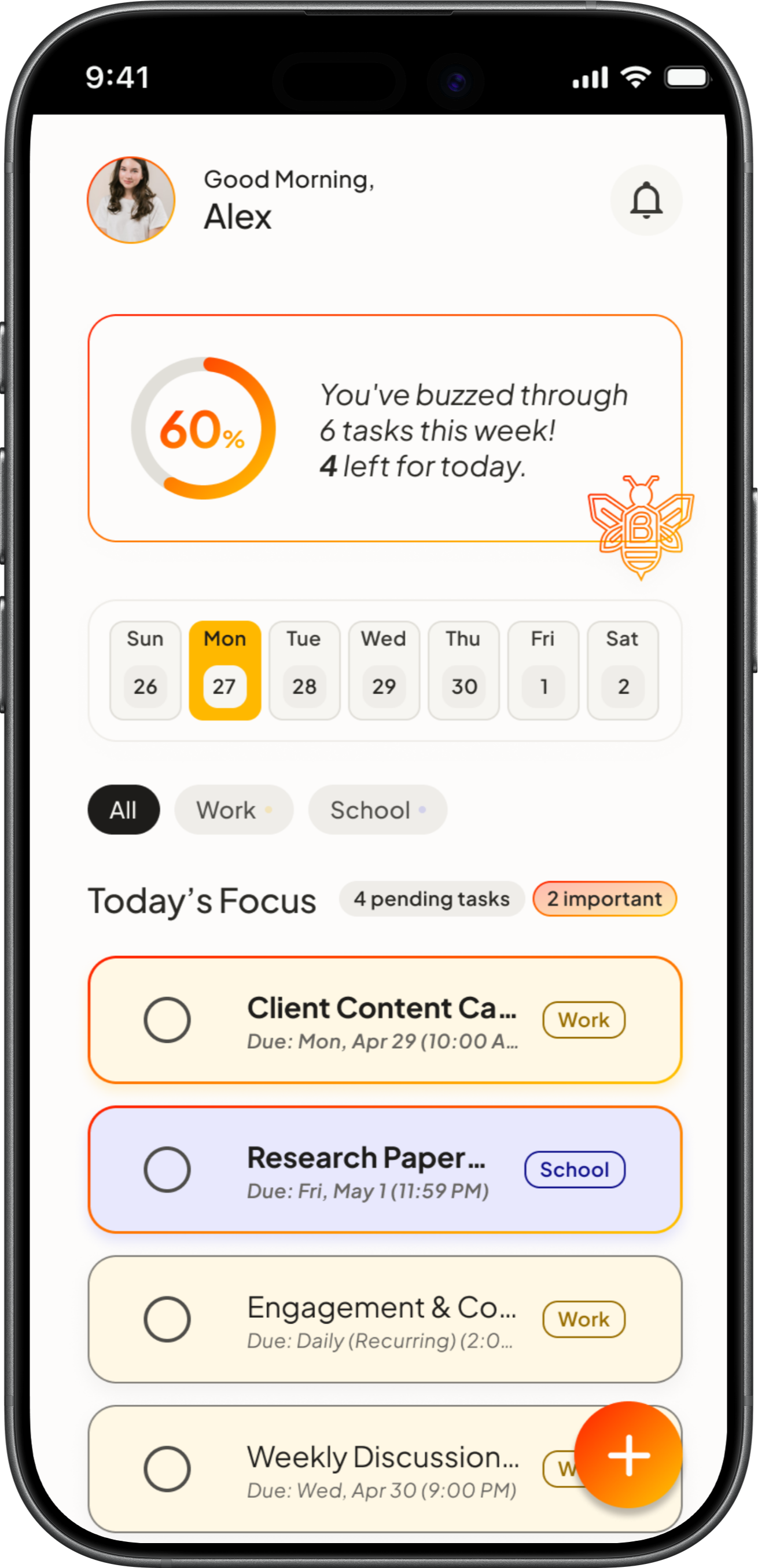
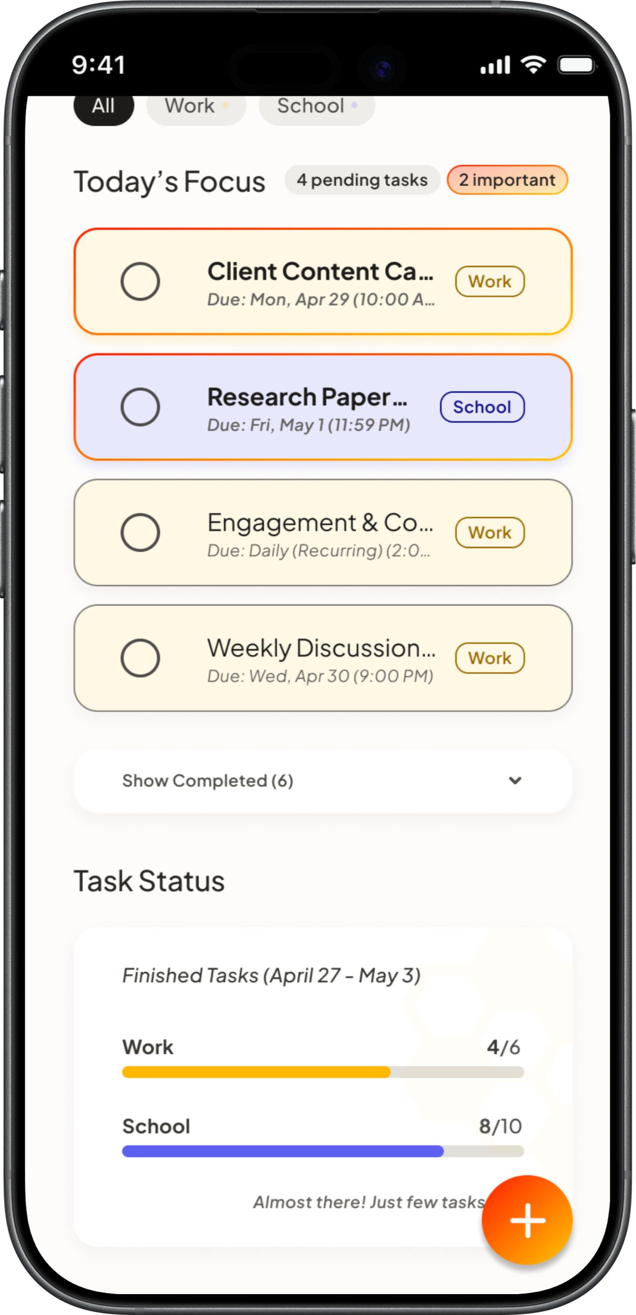
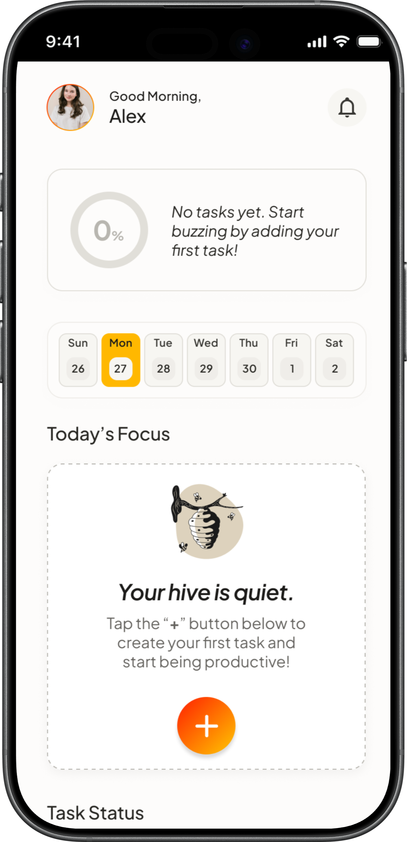
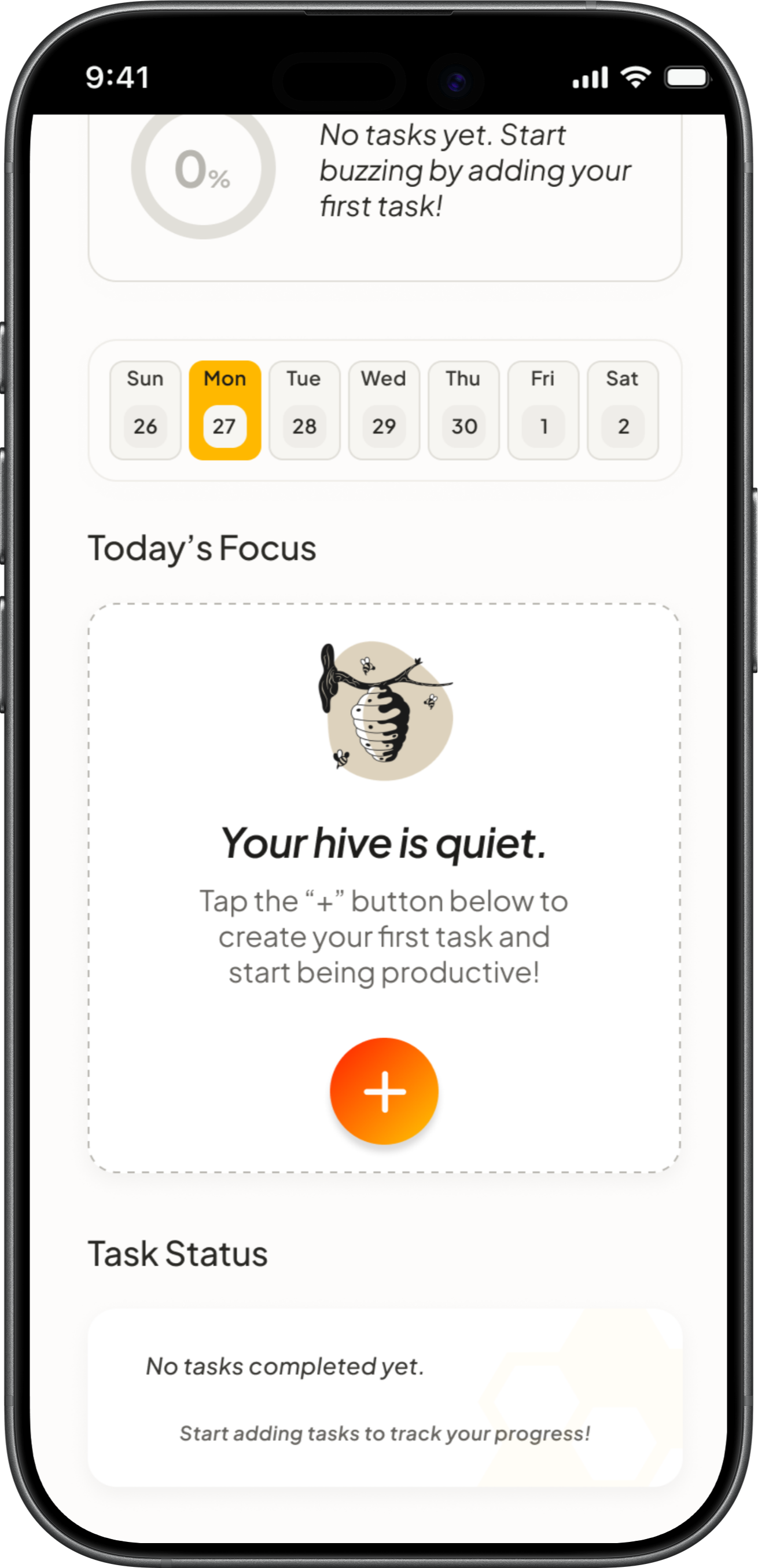
The outcome of a structured design process. I lead with the interface, followed by the systematic logic that built it.
.png)
.png)
// THE_BRIEF
Problem & Solution
The Problem
Most to-do list apps feel like cold, industrial spreadsheets. For students and freelancers juggling multiple roles, staring at a massive, unorganized text list causes visual confusion and ‘task anxiety’ that makes them avoid planning altogether.
The Solution
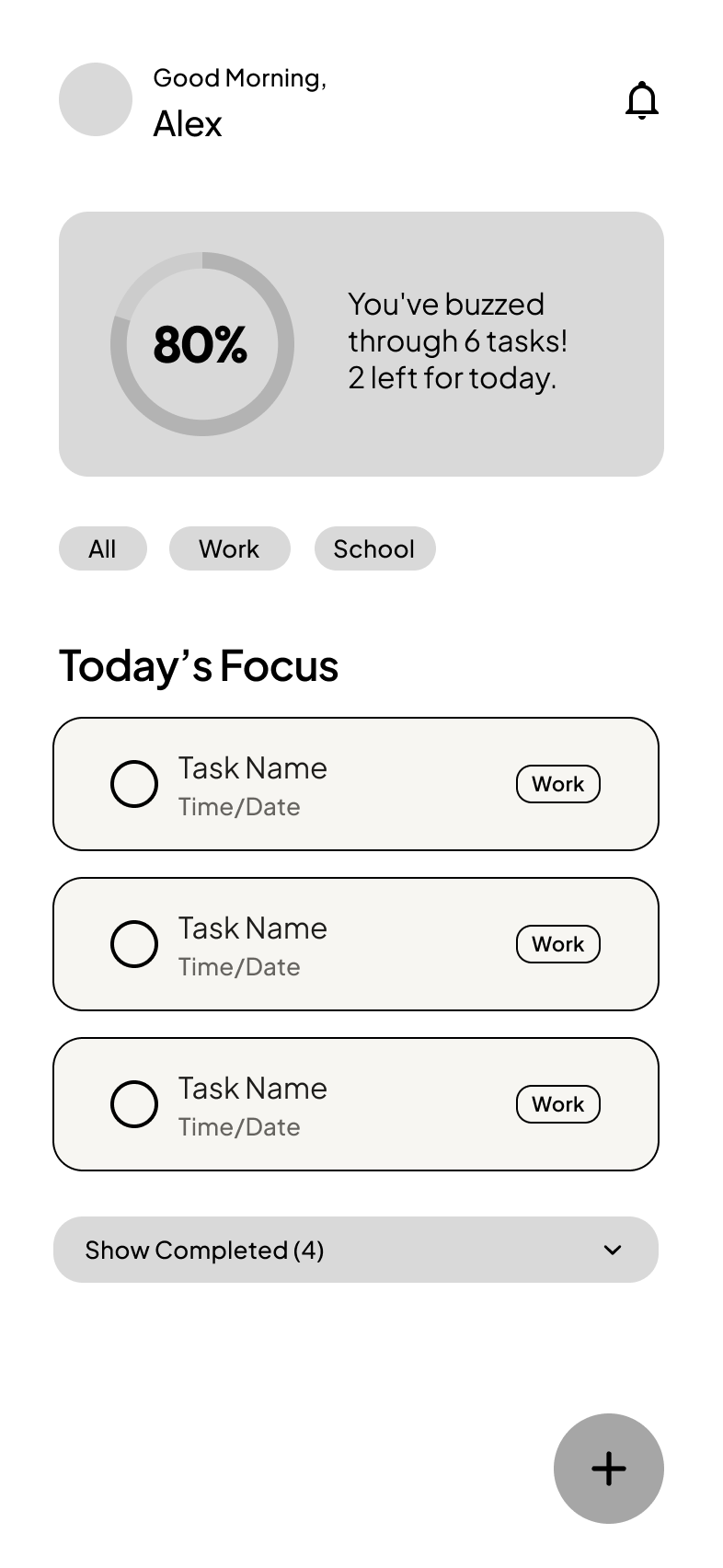
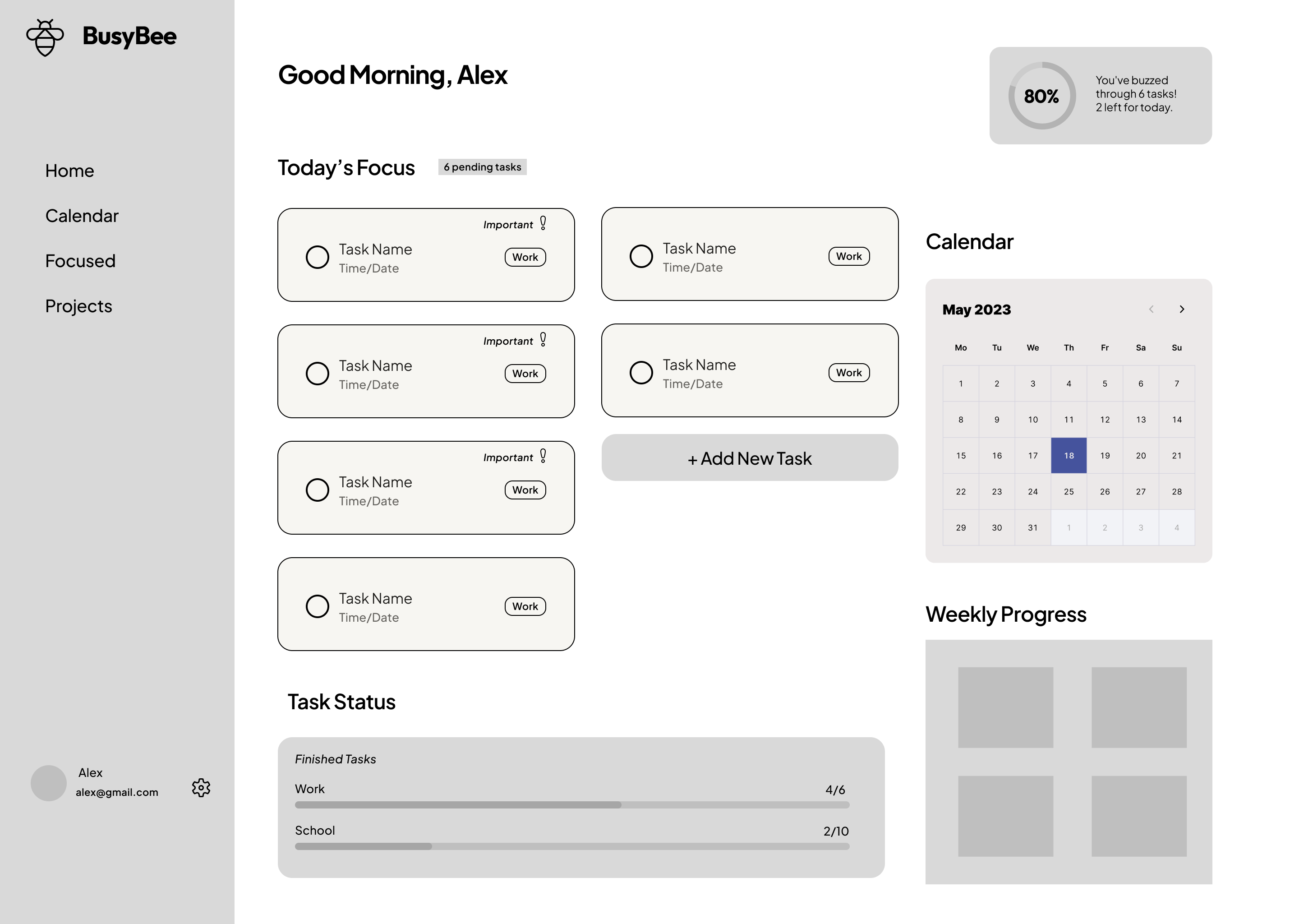
BUSYBEE: A warm, honey-themed dashboard that replaces clinical lists with organized Bento cards, semantic colors to separate work from life, and progress trackers that give a small boost of visual satisfaction.
// METHODOLOGY
AI-Augmented Workflow
Strategy & Psychology
Architecture & Logic
Visual Identity & System
Systematic Execution
Interaction Design
// THE_EVIDENCE
The Blueprint
USER PERSONA
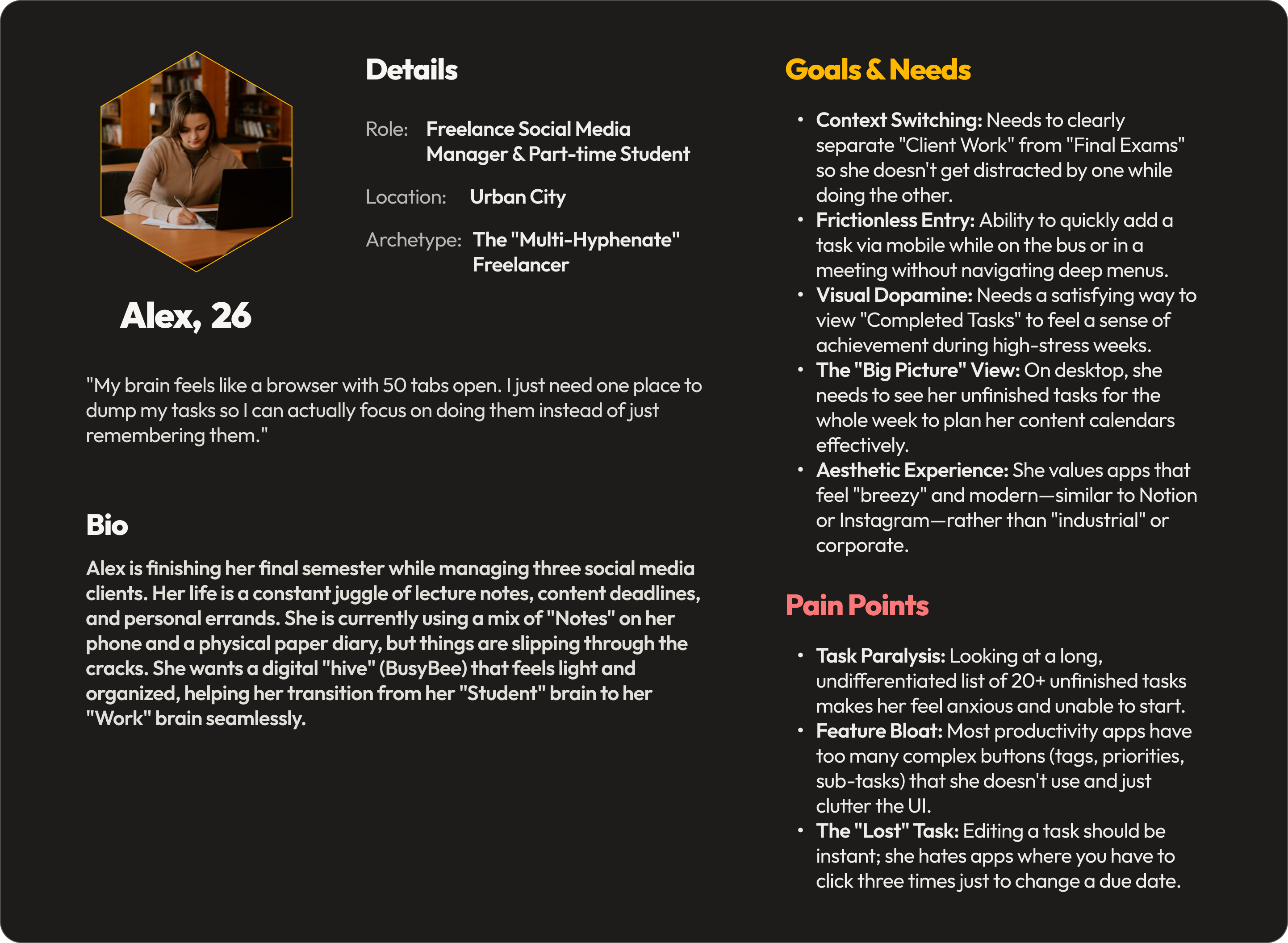
I focused on Alex, a freelancer and student who finds traditional productivity tools cold and overwhelming. She doesn't need a corporate project manager or complex sub-menus; she needs a warm, uncluttered space that separates her school and work identities into clear visual cards, making daily organization feel like a small, satisfying win.
Meet the ‘Multi-Hyphenate’ Freelancer: Alex
USER FLOW
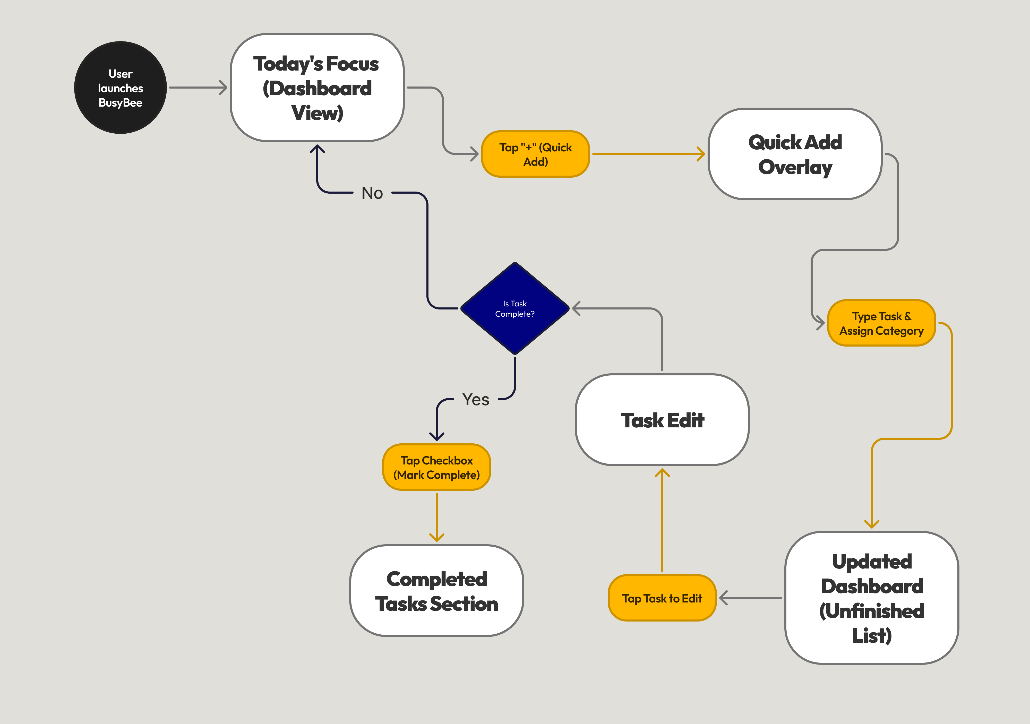
I designed a user flow that eliminates navigation friction. Because the mobile FAB and desktop button are permanently visible on the dashboards, users can type, tag, and organize school versus work goals in a single view.
IDEATION & WIREFRAMING
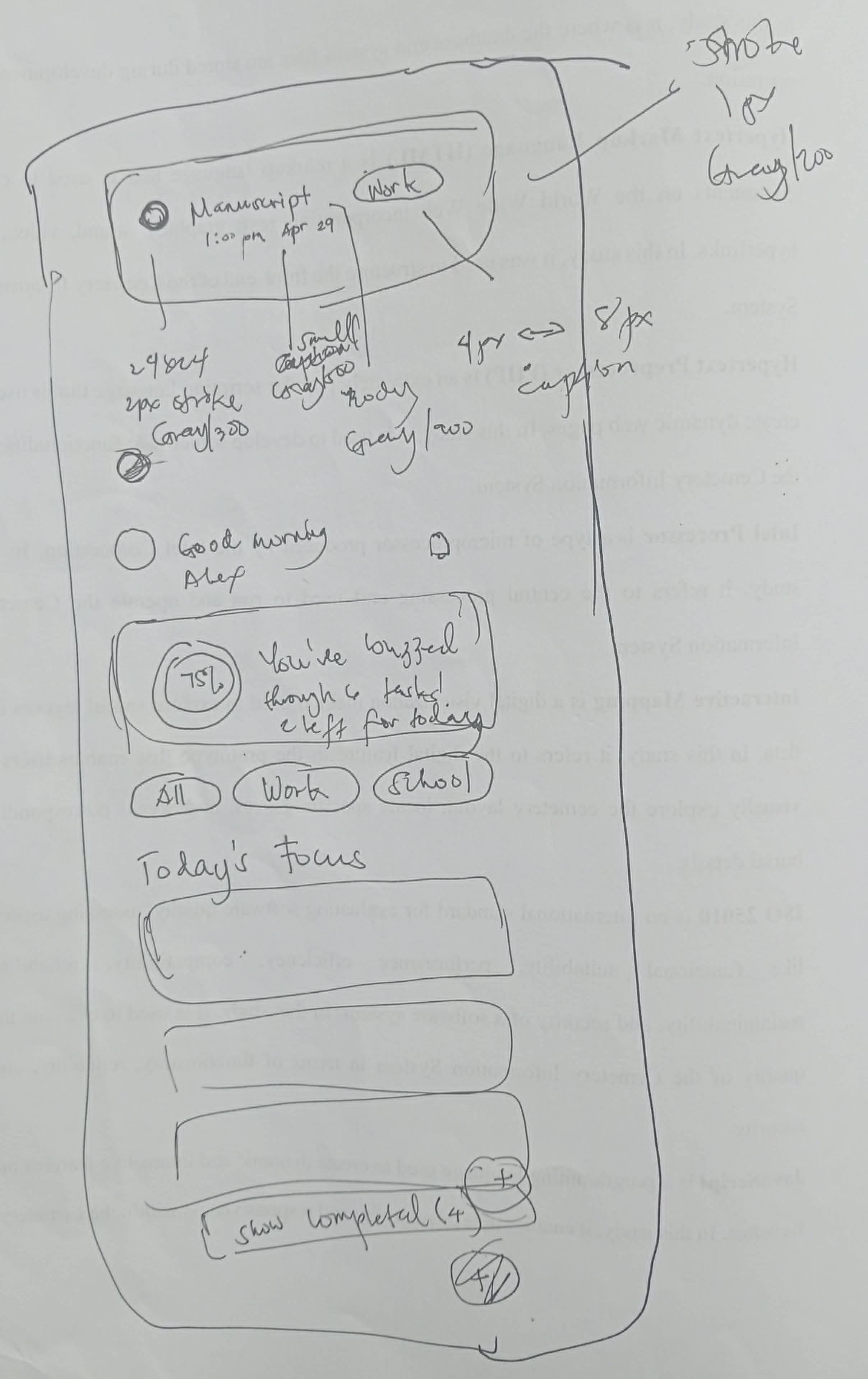
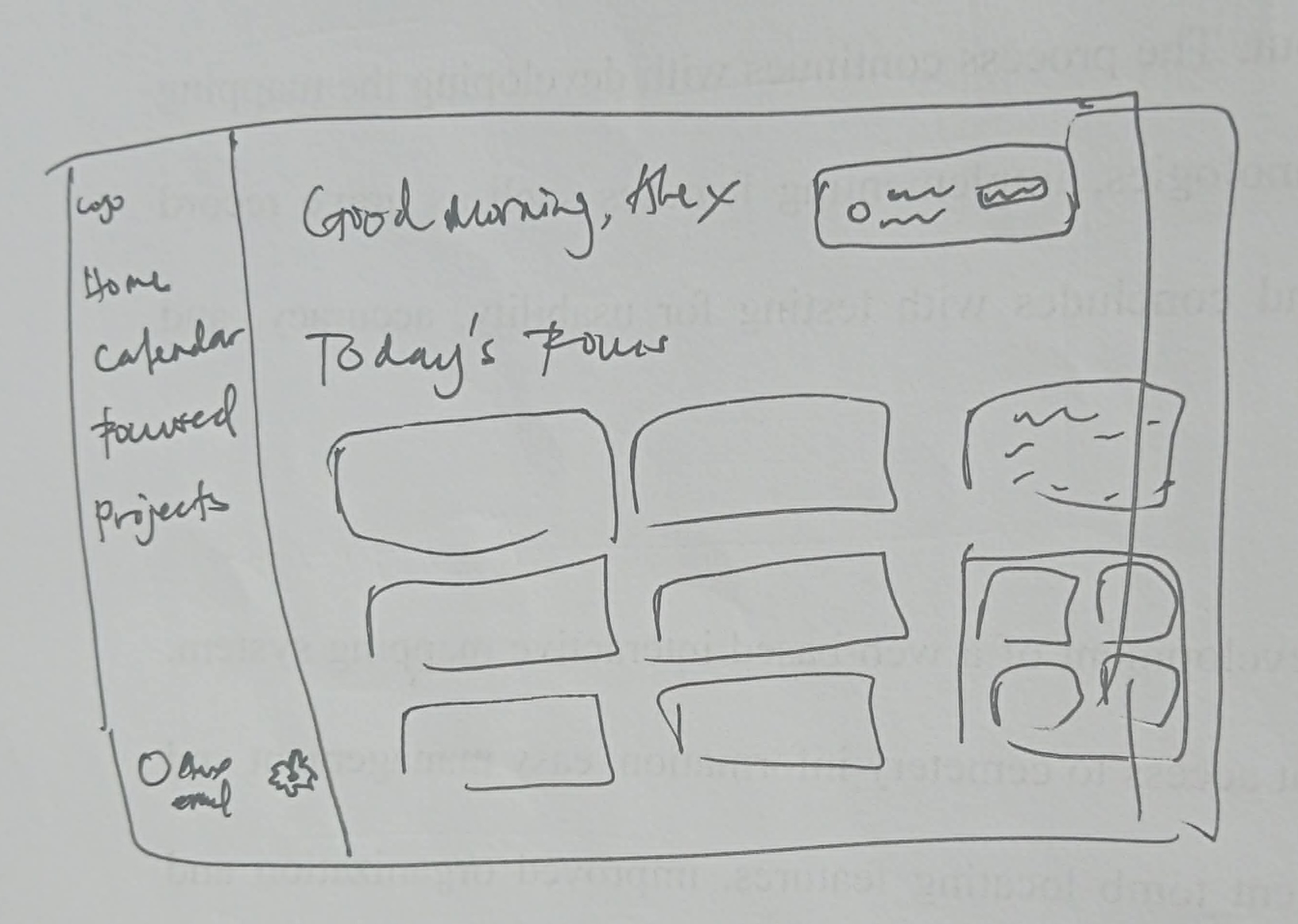
I started with sketches focused on scannability to keep the dashboard organized across screen sizes.
This led to a responsive structure in Figma where I tested the layout logic before moving to high-fidelity design.
DESIGN TOKENS
I chose warm honey-gold brand colors paired with a functional indigo secondary to provide clear visual separation between work and school tasks.
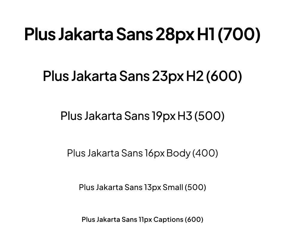
For typography, I used Plus Jakarta Sans—its friendly, modern proportions ensure that shifting between roles remains approachable and easy to scan.
Every choice, from the CTAs to the gradient-stroke priority cards, was made to turn a chaotic 'brain swarm' into a focused, calm productivity experience.
Color System
BRAND COLORS
--brand-primary
#FFB800
--brand-secondary
#5D5FEF
--brand-accent
#FF1F01 - #FFC700
NEUTRALS/GRAYS
--gray-bg
#FDFCFB
--gray-sub-borders
#F7F6F2
--gray-200
#EFEDE9
--gray-300
#E1DFD9
--gray-400
#B8B6B0
--gray-borders
#82807A
--gray-600>
#666460
--gray-700
#4E4D49
--gray-800
#393834
--gray-titles
#292824
--gray-dark-text
#4E4D49
Typography Scale
Logo
CONCEPT GENERATION

MANUAL VECTORIZATION
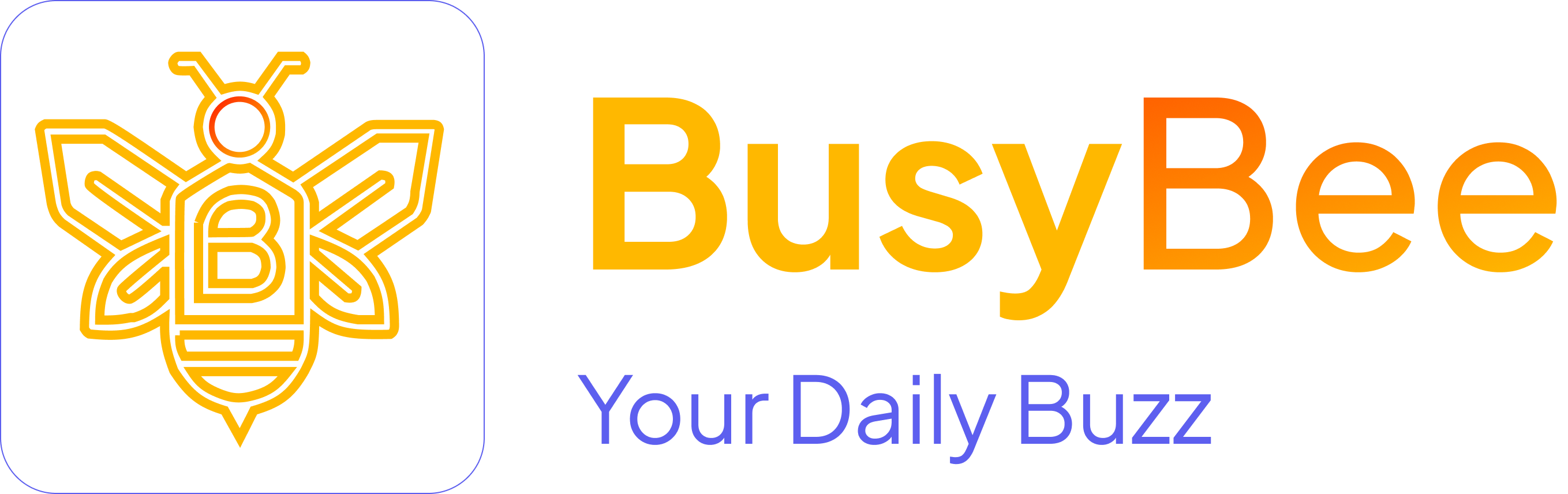
For the logo, I used AI to explore a wide range of visual directions in a short amount of time. Once I found a concept that matched the vibe, I vectorized and refined it to ensure it was precise and scalable.
MOODBOARDING
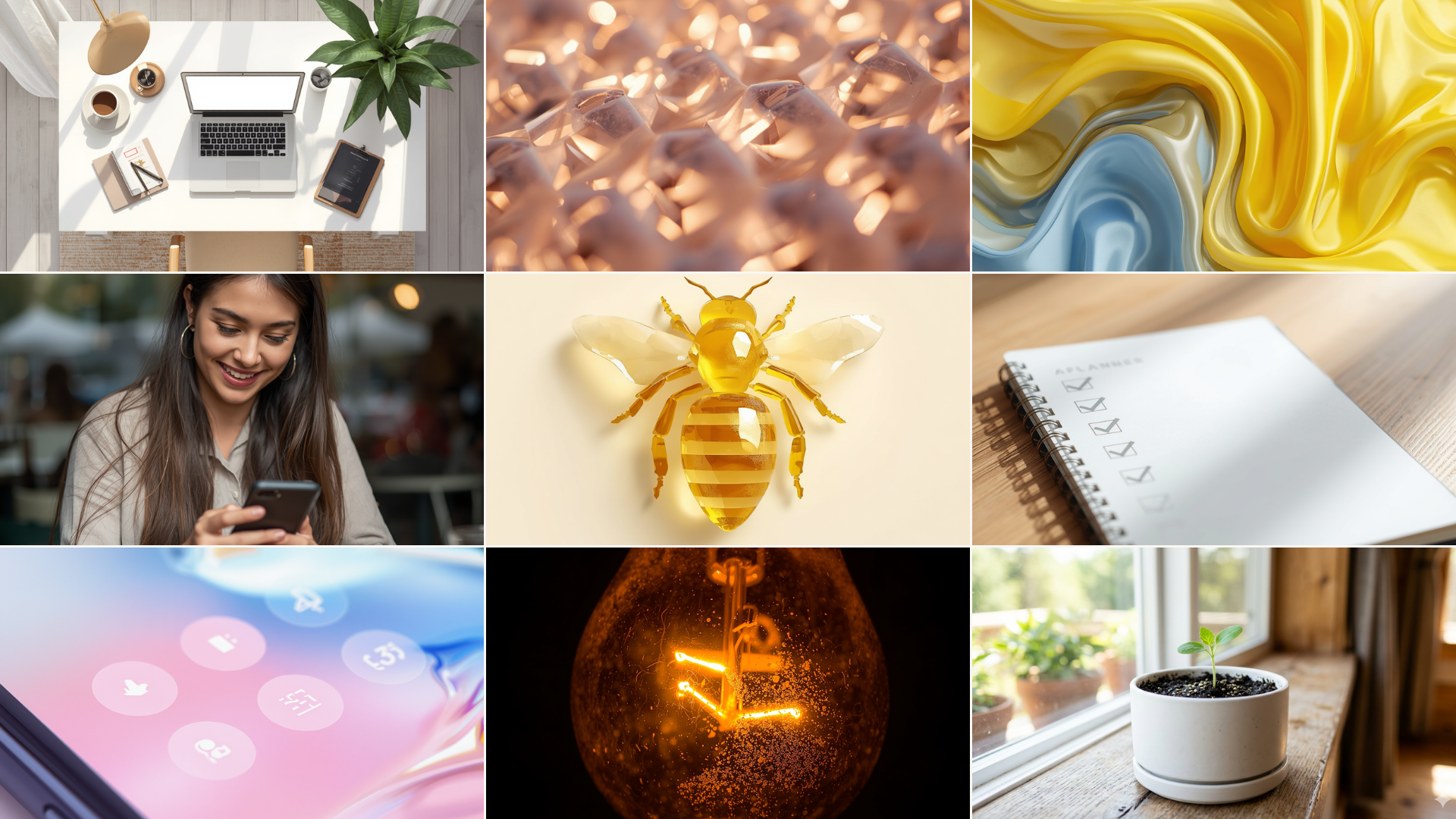
I used AI to quickly spin up a 3x3 moodboard to pin down our visual direction early. I grouped these into nine core pillars to make sure the final look balanced industrious efficiency with a warm, mindful feel.
COMPONENTS
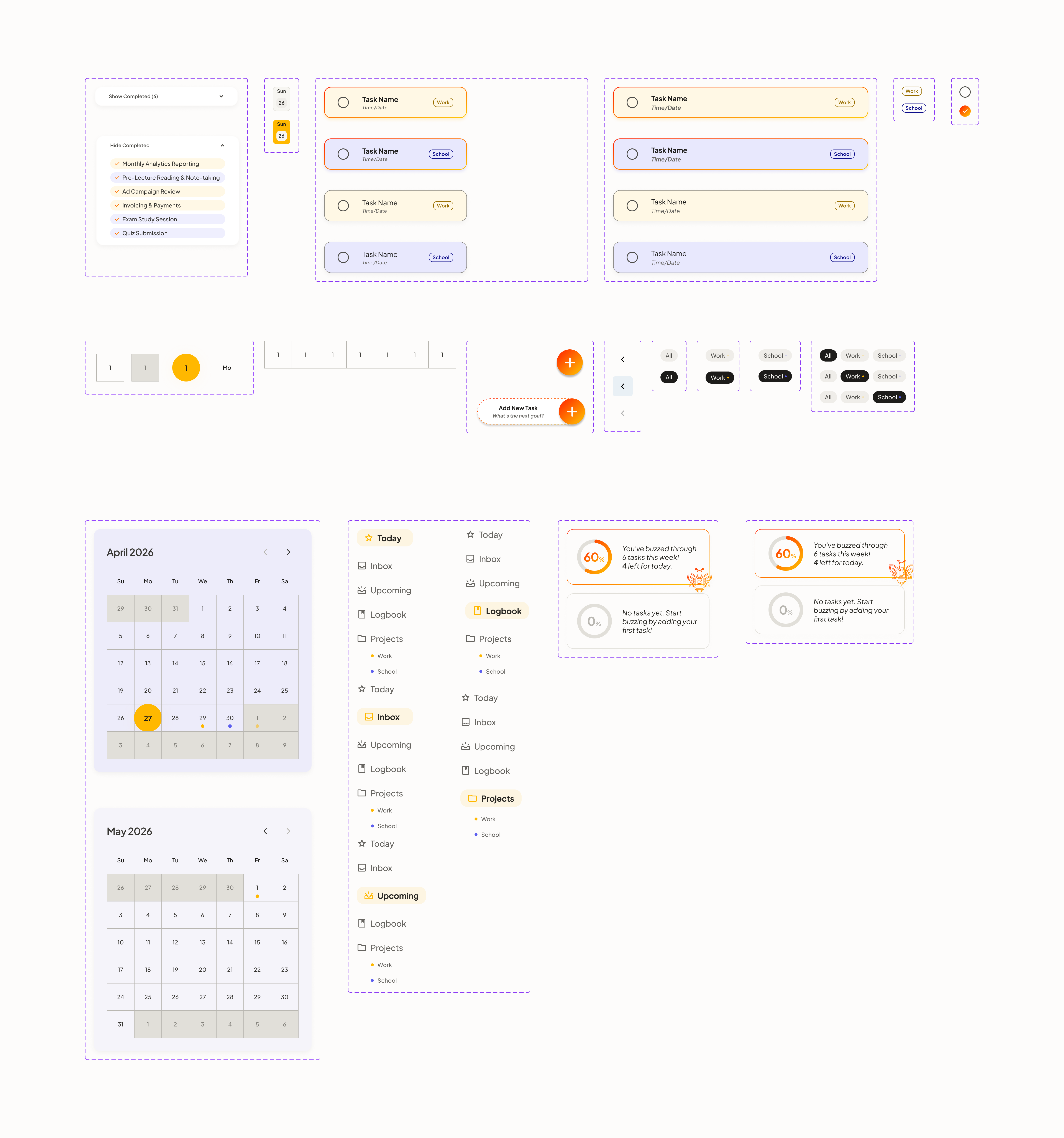
I built a library of cross-platform components and interactive states to ensure the experience remains completely consistent from Desktop to Mobile.
I used Bento-style widgets and progress rings to provide immediate visual feedback and clear scannability. By implementing a 1.5px priority stroke, I ensured that urgent tasks immediately draw the eye while secondary planning tools stay subtle.
Using a modular system of color tags and quick-add buttons makes switching between 'Work' and 'School' tasks completely effortless.
PROTOTYPING
I turned my final designs into an interactive prototype to stress-test the task lifecycle. I mapped out four primary paths to balance visual scannability with rapid information capture:
- App Entrance: Setting up an automated screen transition that smoothly lands the user onto their centralized Bento layout.
- Layout Resilience: Testing the screen transition from the 'Quiet Hive' empty state to a dense task list to verify that grid spacing holds up under high data loads.
- The Entry Shortcut: A live test of the fast-capture shortcuts—utilizing the desktop 'Add New Task' block and mobile FAB to log reminders in a single view.
- Responsive Behavior: Reviewing the interface animations across both desktop and mobile viewports to ensure components look and act cohesively on any screen.
// TAKEAWAYS
Reflection &
Final Thoughts
“What began as a tight 3-day design constraint for BusyBee became my personal proof that speed doesn't have to break design logic or visual precision.”
This project was a crash course in designing under pressure. Building a complete brand identity and a cross-platform interface in just 72 hours taught me that a tight workflow is the only way to meet a heavy deadline. By locking into my 'Honey-tinted' palette and the 1.5px border system early on, I was able to design rapidly without losing the pixel-perfect quality the brief required. It proved to me that my process holds up even when the clock is ticking.
Even though this project was a take-home test for Frost Design Group, the real win was pushing my own limits. I wanted to prove I could balance creative layout design with strict technical organization. Seeing my design peers immediately understand the Bento structure and visual hierarchy was a huge boost to my confidence. It showed me that my skills are completely ready for the fast-paced, high-stakes environment of a real design agency.
I’m incredibly proud of the discipline I maintained over those three intense days. Despite the rush, I didn't cut corners; I treated every layer name, component variant, and grid layout alignment with the accountability of a live product. I didn't just fill a checklist—I tried to add value by transforming a simple text-heavy list into a calm, mindful planning tool. Pushing this out right after completing Aura Finance showed me how much my speed and technical standards have grown.
.png)