Fintech
AURA FINANCE
A mobile application designed to simplify personal finance by offering real-time goal tracking and an intuitive, desaturated interface built to reduce cognitive load and user hesitation.

// Across
- Role
// Down
- Duration
// HIGH FIDELITY
Visual Interface
The outcome of a structured design process. I lead with the interface, followed by the systematic logic that built it.
.png)
.png)
.png)
.png)
.png)
// THE_BRIEF
Problem & Solution
The Problem
Traditional banking applications overwhelm users with dense data and poor visual hierarchy, leading to a state of ‘financial anxiety’ that prevents students and recent graduates from maintaining consistent saving habits.
The Solution
AURA FINANCE: Replacing financial stress with a modular, goal-focused dashboard and a 2-tap shortcut that makes saving feel instant.
// METHODOLOGY
AI-Augmented Workflow
Strategy & Psychology
Architecture & Logic
Visual Identity & System
Systematic Execution
Interaction Design
// THE_EVIDENCE
The Blueprint
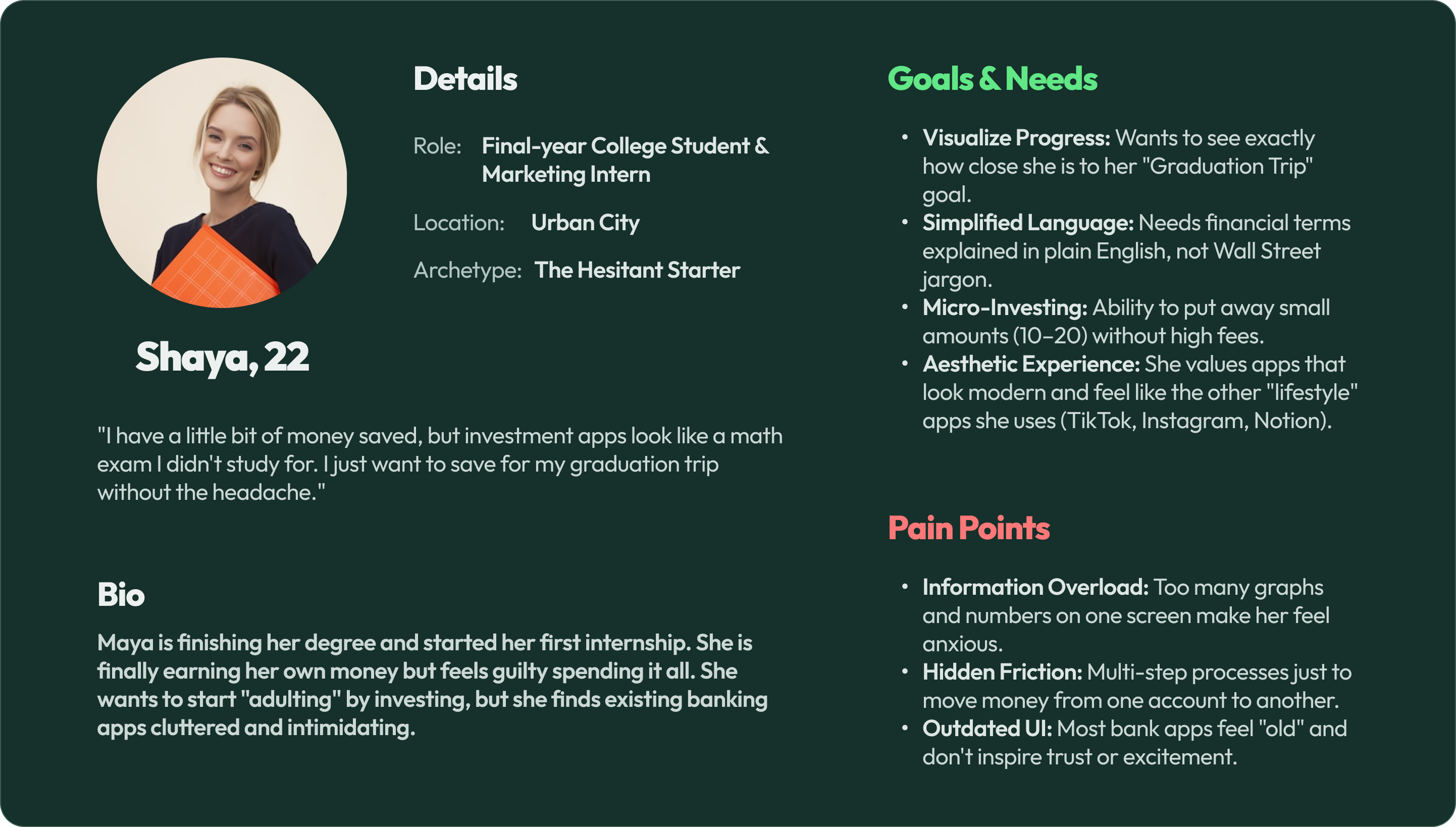
USER PERSONA
I focused on Shaya, a ‘hesitant starter’ who finds typical banking apps stressful. She doesn’t need more data; she needs a calm, jargon-free space that turns saving into a small, satisfying habit through simple actions and visual rewards.
Meet ‘The Hesitant Starter’: Shaya
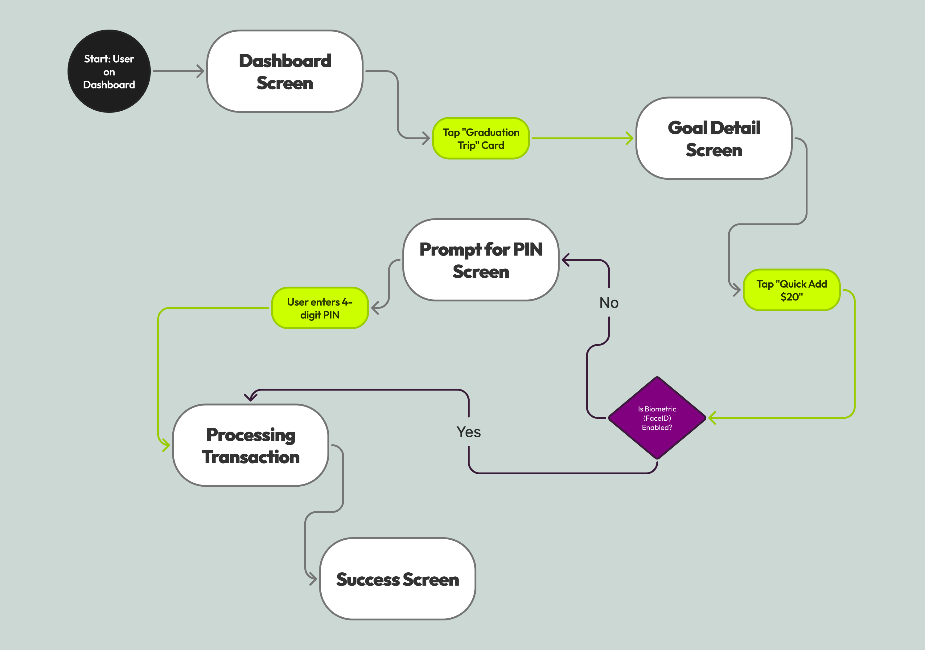
USER FLOW
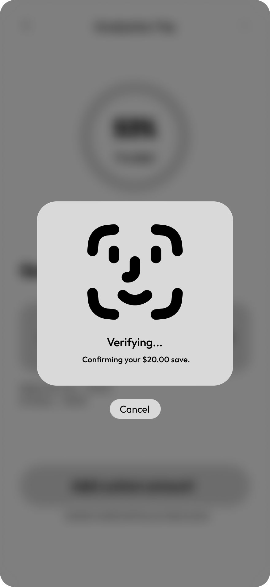
I designed the user flow to put Shaya’s goals front and center, featuring a 2-tap ‘Quick Save’ flow. By enabling FaceID for security, I removed the need for clunky passwords while keeping her data protected.
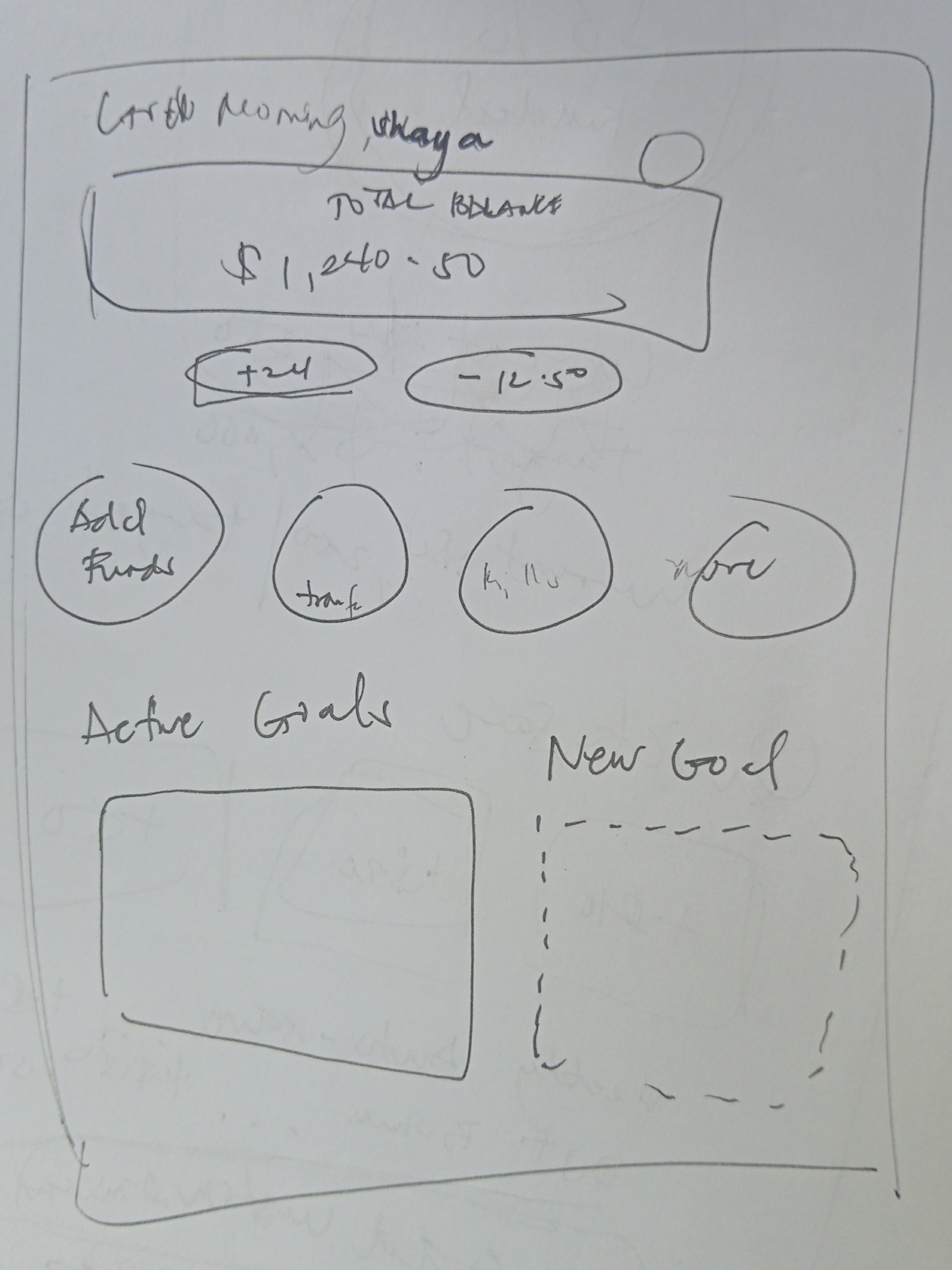
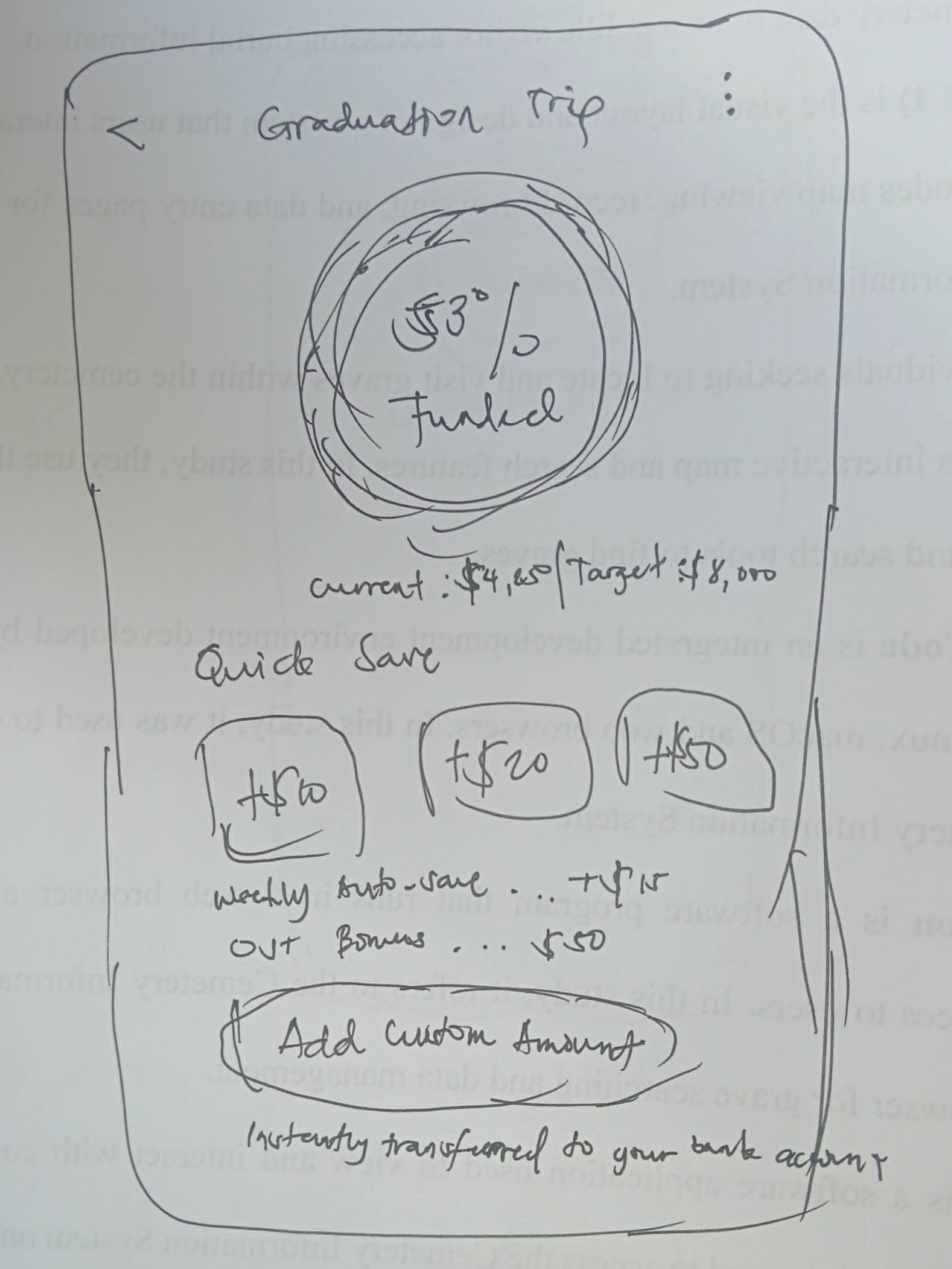
IDEATION & WIREFRAMING
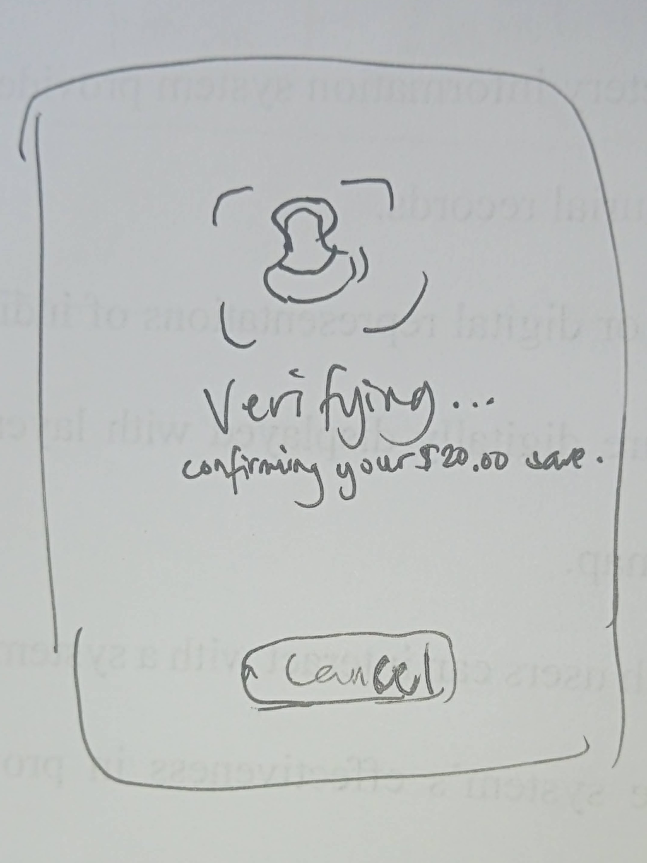
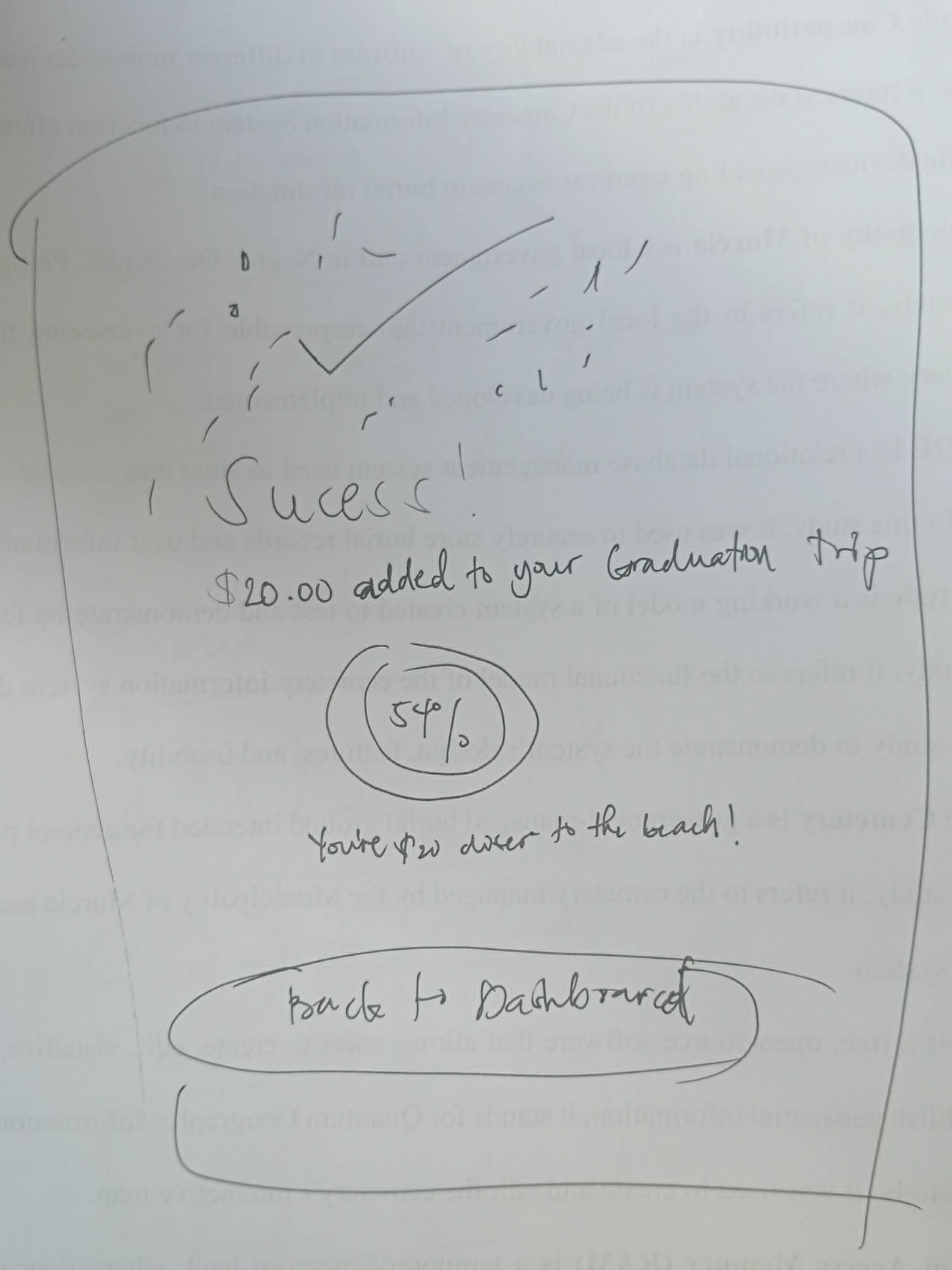
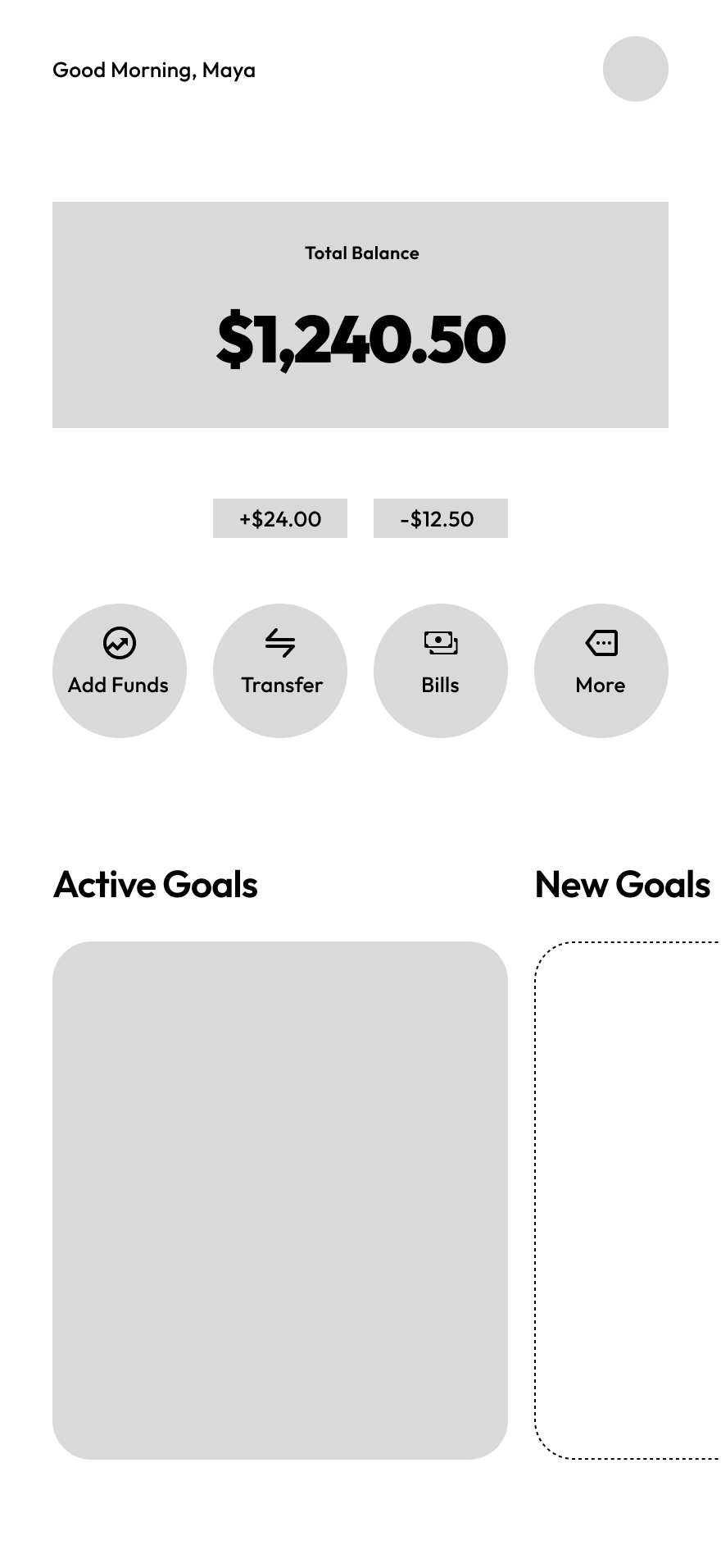
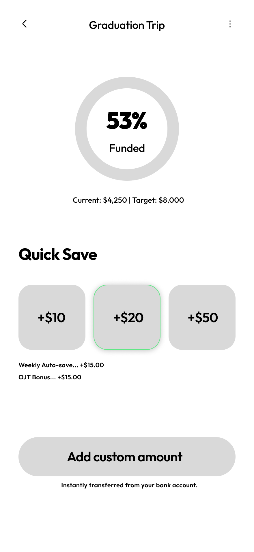
I initiated the process with sketches focused on hierarchy, ensuring the dashboard remained clean and goal-centric.
This led to mid-fidelity wireframes in Figma where I validated the saving logic prior to high-fidelity execution.

DESIGN TOKENS
I chose high-contrast colors paired with warm, dark neutrals to make the data feel less intimidating.
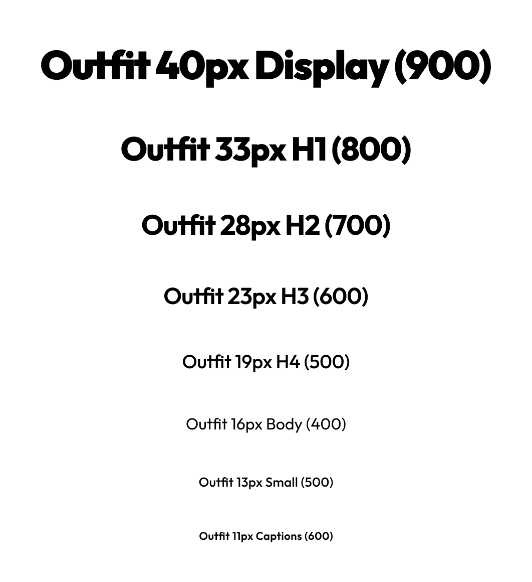
For the typography, I used Outfit—it’s clean and modern, making sure the numbers are easy to read at a glance.
Every choice, from the logo to the spacing, was made to turn a stressful banking task into a calm, focused experience.
Color System
BRAND COLORS
--brand-primary
#61E786
--brand-secondary
#694873
NEUTRALS/GRAYS
--gray-numbers
#F7F9F8
--gray-titles
#ECF1EF
--gray-200
#DDE6E3
--gray-sub-text
#CBD8D4
--gray-400
#B2C6C1
--gray-captions
#819B95
--gray-borders
#3D5C54
--gray-900
#203A34
--gray-main-bg
#16302B
SEMANTIC COLOR
--semantic-deficit
#FC7878
Typography Scale
Logo
.png)
CONCEPT GENERATION
.png)
MANUAL VECTORIZATION
.png)
For the logo, I used AI to explore a wide range of visual directions in a short amount of time. Once I found a concept that matched the vibe, I vectorized and refined it to ensure it was precise and scalable.
MOODBOARDING
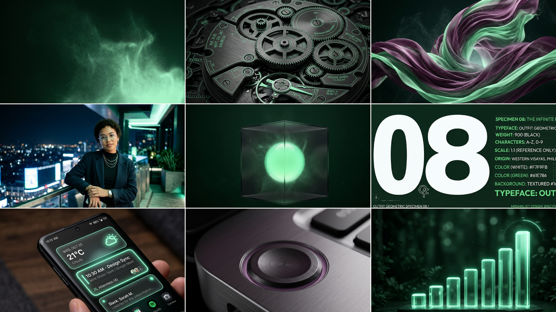
I used AI to quickly spin up a 3×3 moodboard to pin down our visual direction early. I grouped these into nine core categories to make sure the final look balanced clean, technical logic with a calm, reassuring feel.
COMPONENTS
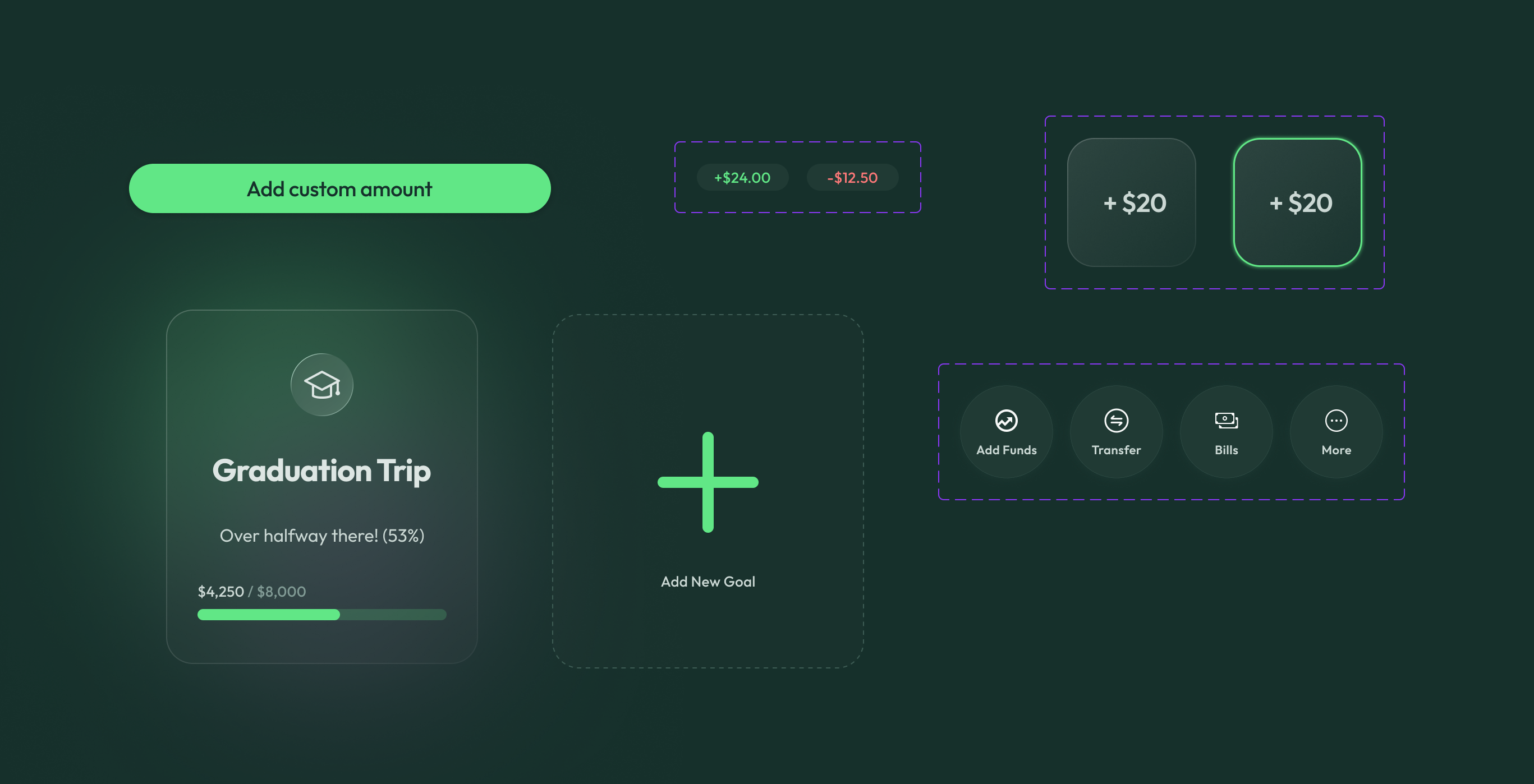
I built a library of atomic components and interactive states to keep the experience consistent.
I used high-contrast buttons for custom amounts and glass-morphic cards to show goal progress at a glance.
By using a modular system for the ‘Quick Save’ actions, I made sure the most important tasks were always just a tap away.
PROTOTYPING
I turned my final screens into an interactive prototype to stress-test the core user loops. I mapped out four primary paths to balance transactional speed with clear visual safety checks:
- Onboarding: Using automated transitions to seamlessly land the user onto their main Dashboard.
- Goal Views: Moving back and forth between the overview and savings highlight.
- The ‘Quick Save’ Sprint: A live test of the custom transaction flow, including an option to cancel out of the FaceID verification if a user misclicks.
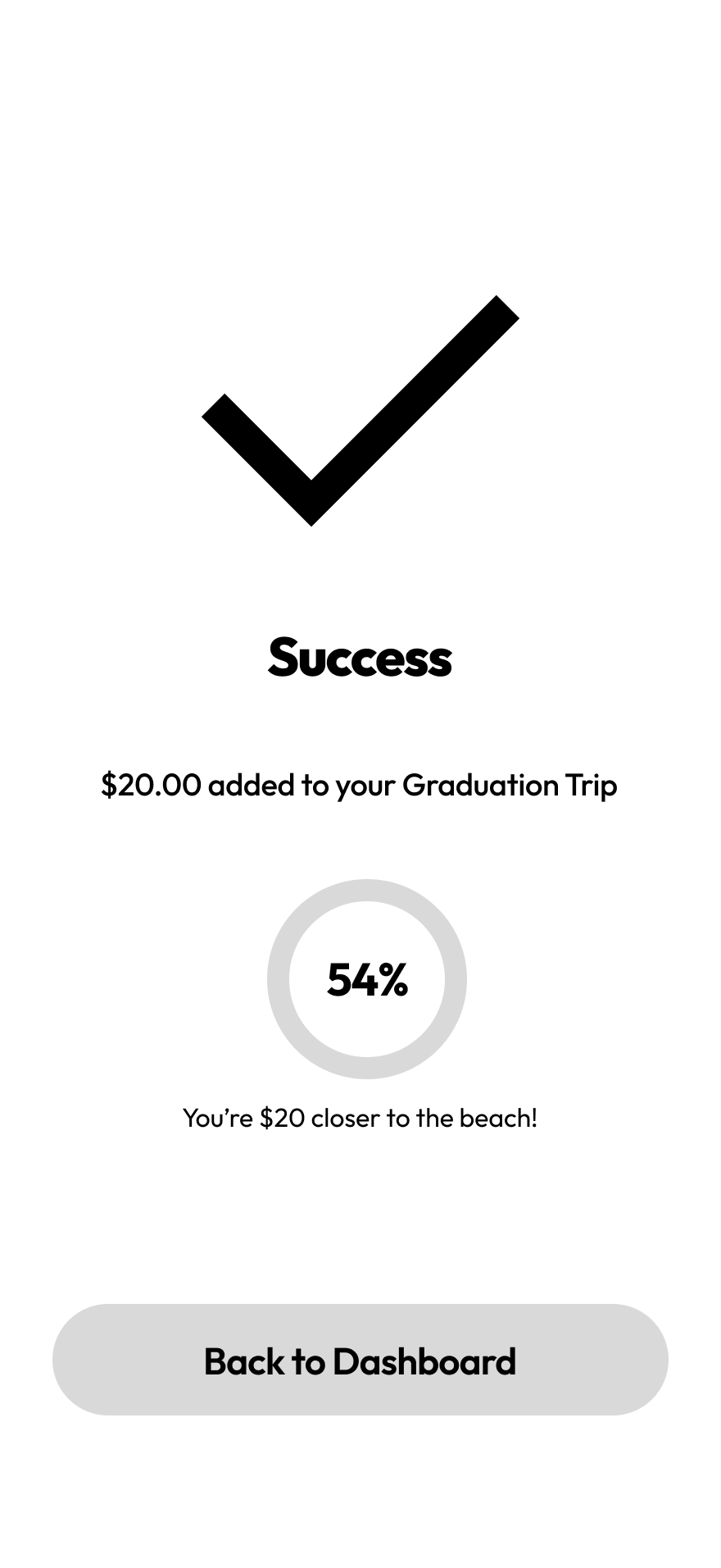
- The Success Loop: Ensuring the completion animations feel rewarding before sending the user back to the start.
// TAKEAWAYS
Reflection &
Final Thoughts
“I built Aura to replace overwhelming banking spreadsheets with a calm, intentional dashboard.”
This project was a huge turning point for me. For the first time, I moved past just ‘making pretty screens’ and focused heavily on design infrastructure. I learned that a premium product isn’t built on glowing gradients—it’s built on the technical precision of a design system. Working with a strict neutral scale and defining 28+ tokens taught me how to balance visual flair with real-world usability.
When I shared the early designs with friends and peers, the feedback was instant. While they loved the dark, monochromatic aesthetic, the biggest win was hearing people say, “I would actually use this to save.” It proved my initial theory right: Gen Z doesn’t want another spreadsheet. They want financial tools that speak their visual language without making them feel overwhelmed.
I’m incredibly proud of the ownership I took over Aura. Even though this was a personal study, I treated it like a real-world product. Every ‘aura’ glow and glassmorphic card had to earn its place by serving a functional purpose. Transforming a task that usually feels like a stressful math exam into an experience that gives a user a small sense of victory is exactly why I love UI/UX design.
.png)