SAAS
QR TRACK
An admin dashboard replacing paper logs with real-time QR tracking. Designed to help managers monitor clock-ins, handle employee records, and eliminate entry errors.

// Across
- Role
// Down
- Duration
// HIGH FIDELITY
Visual Interface
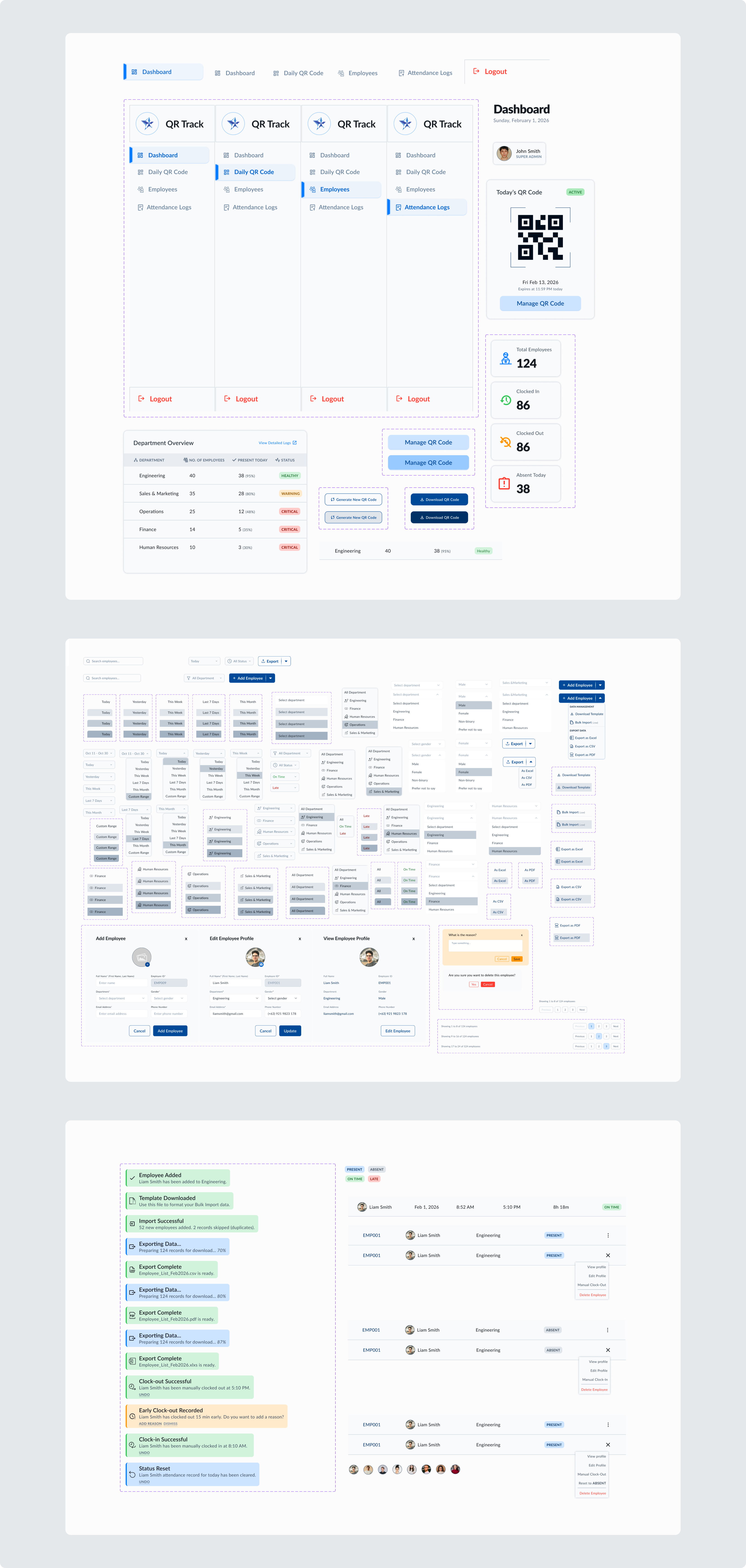
The outcome of a structured design process. I lead with the interface, followed by the systematic logic that built it.
.png)
.png)
.png)
.png)
.png)
.png)
.png)
// THE_BRIEF
Problem & Solution
The Problem
Relying on manual paper timecards forces managers to manually count up hours at the end of the week, leading to human errors, lost logs, and zero real-time visibility over who is actually clocked in..
The Solution
QR TRACK: Replacing paper logbooks with a secure admin dashboard that tracks real-time employee attendance and generates unique daily QR codes to prevent time fraud.
// METHODOLOGY
AI-Augmented Workflow
Strategy & Digitization
Architecture & Logic
Visual Identity & System
Systematic Execution
Interaction Design
// THE_EVIDENCE
The Blueprint
DATA SCHEMA
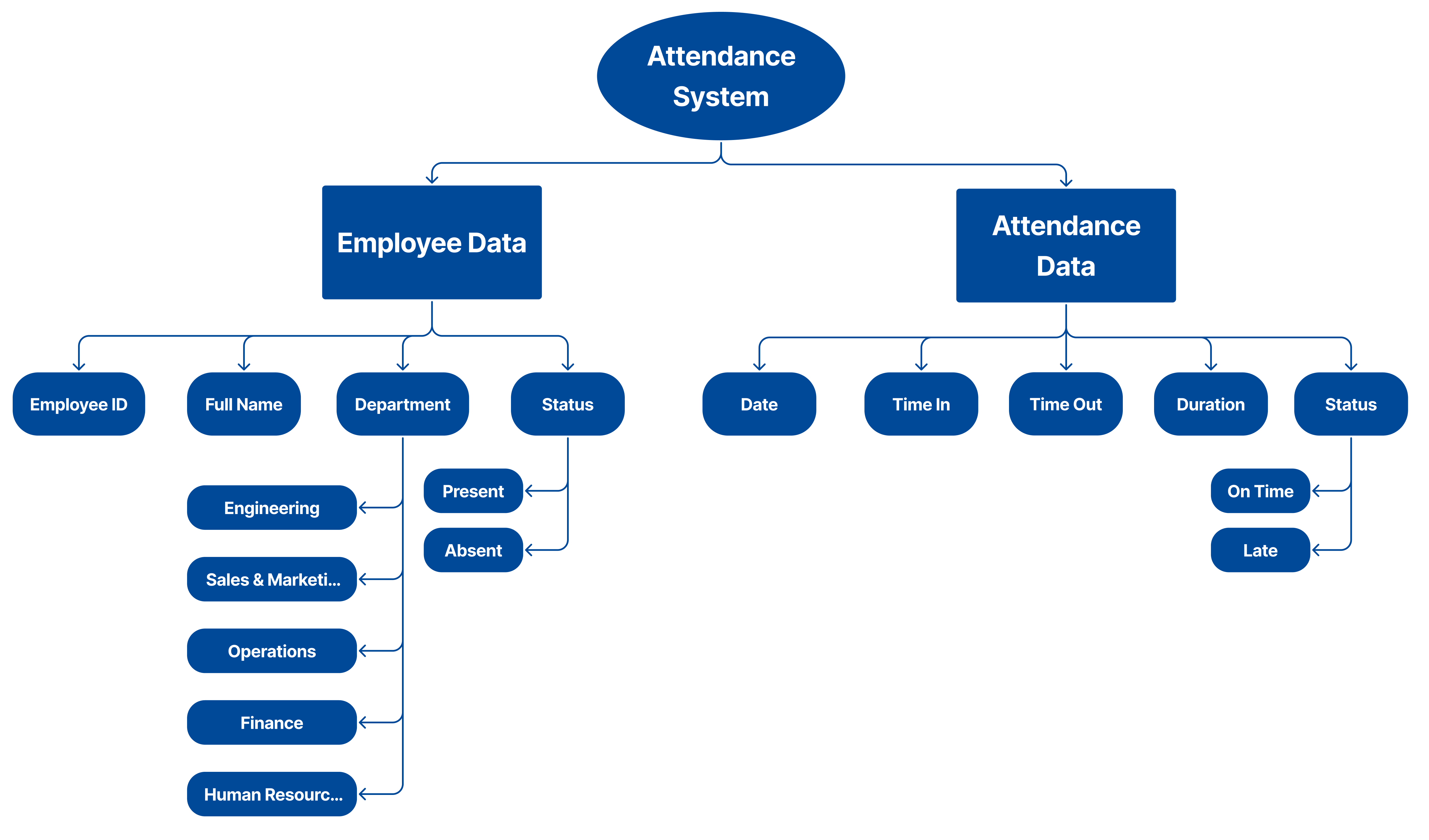
To keep hundreds of employee records organized, I built a data schema that separates static profiles from daily clock-in logs.
Mapping out key statuses—like department tags and 'Late vs. On-Time' indicators—early in the design phase allowed me to build a clean, searchable interface that scales far better than a messy Excel spreadsheet.
WIREFRAMING
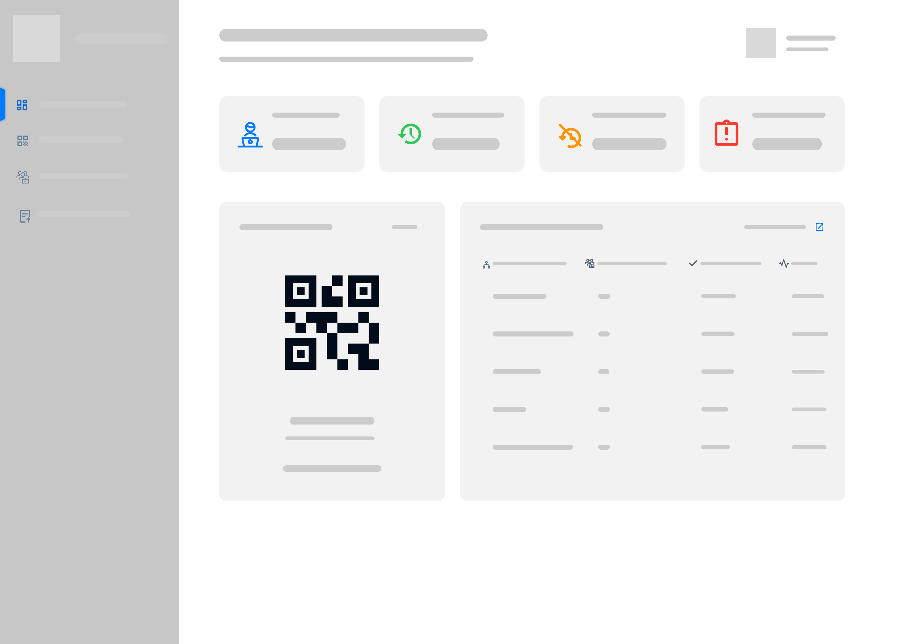
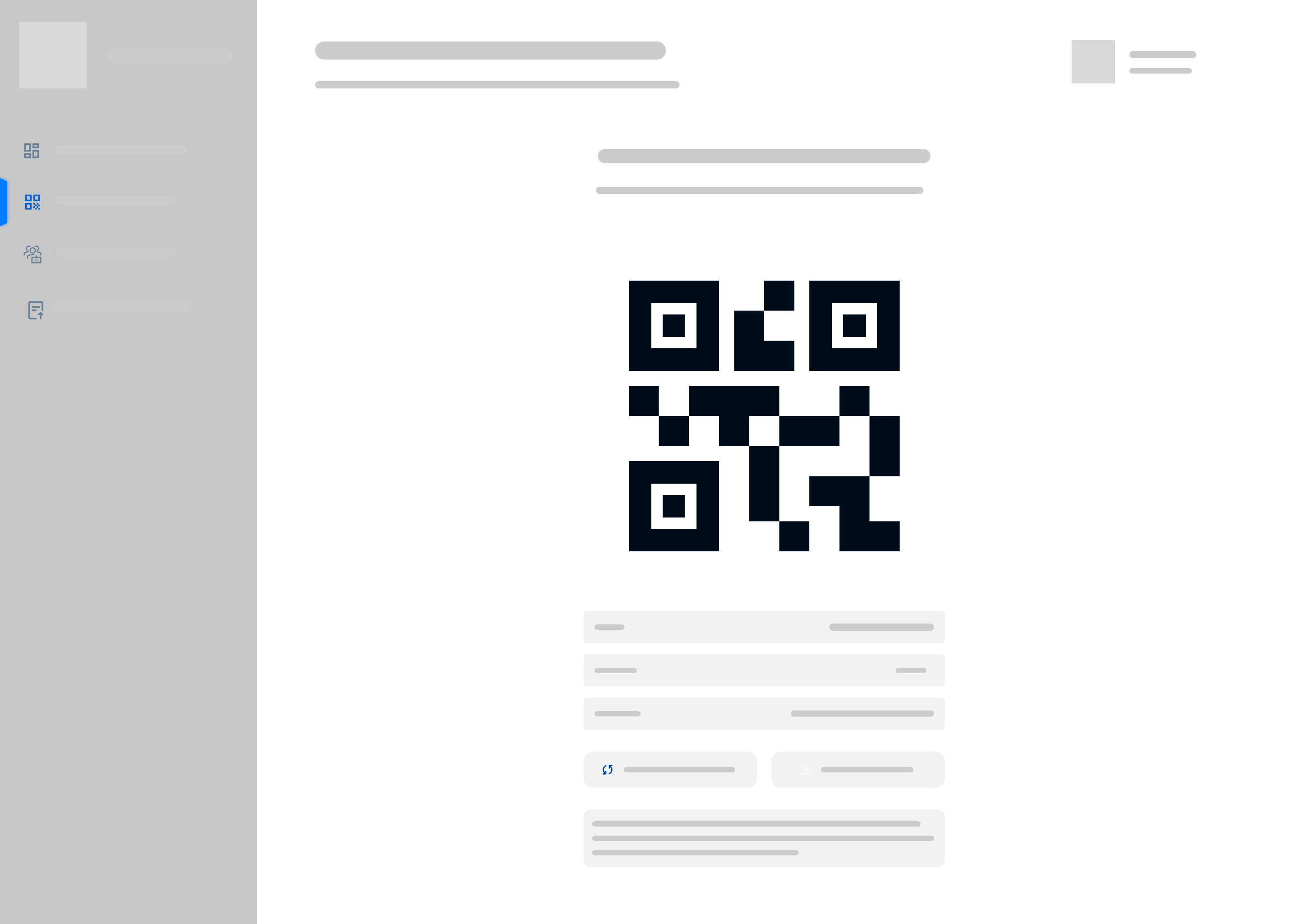
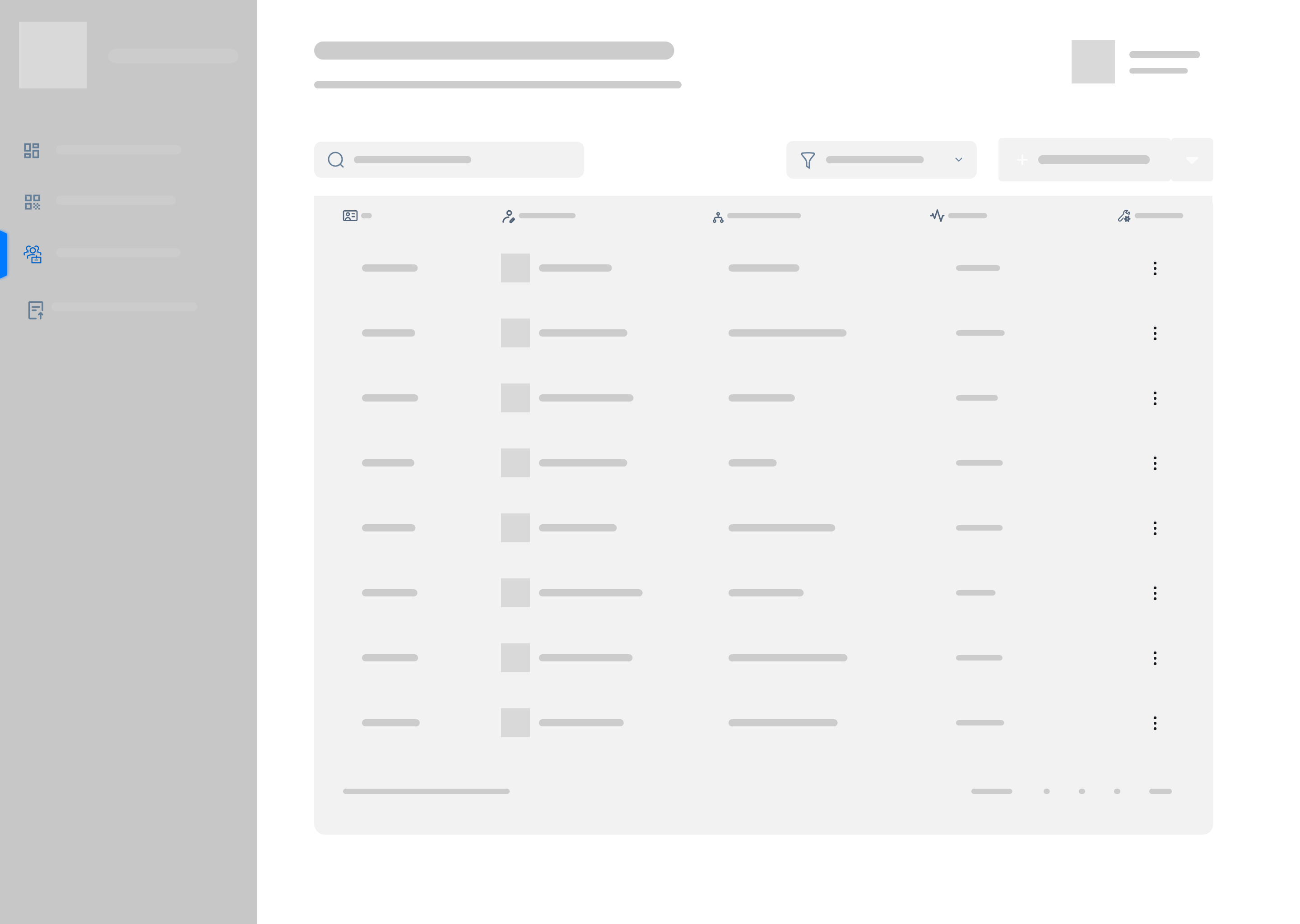
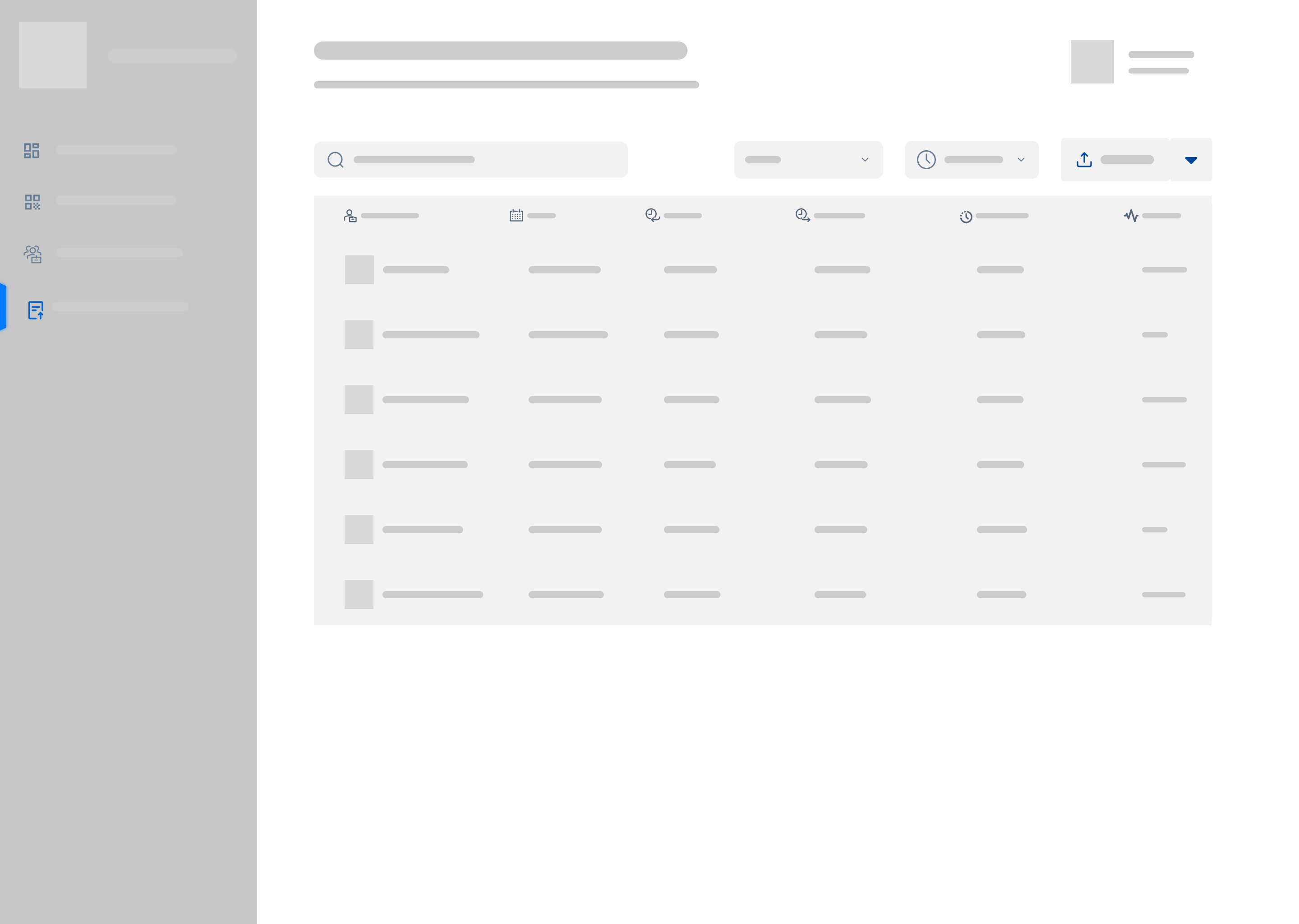
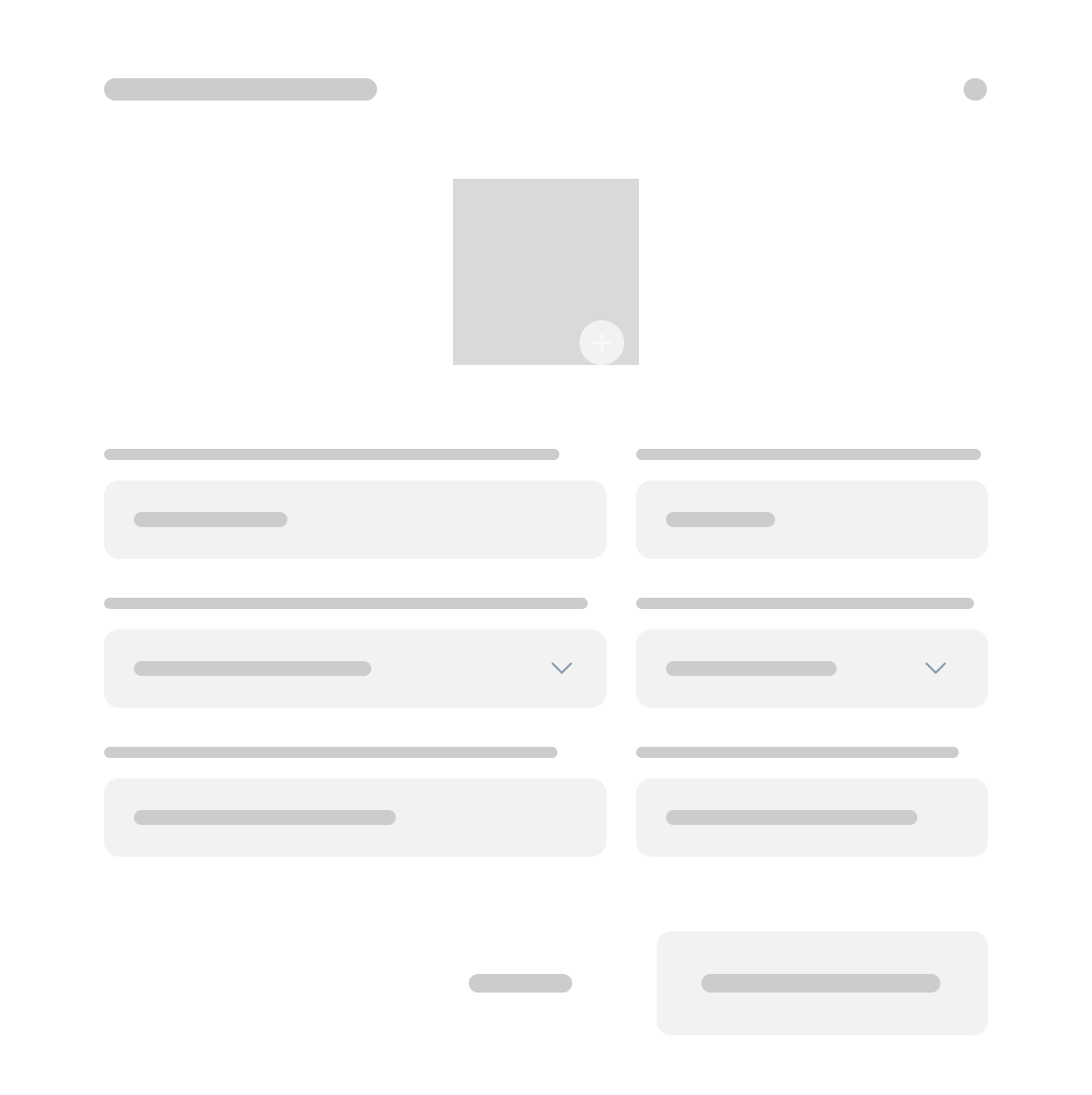
Before diving into high-fidelity UI, I used wireframes to map out the dashboard's screen real estate. This allowed me to prioritize grid spacing and layout hierarchy for the primary data tables, making sure a manager can scan a row of employee logs quickly without getting visual fatigue.
DESIGN TOKENS
To keep things clean during long administrative shifts, I built the entire interface on a strict 8px grid.
I chose Lato for the typography because its clean, compact geometry allows for high information density without looking cluttered.
I also built a 9-step neutral scale to keep the data hierarchy organized, paired with a semantic status system—using clear light and dark color variations so managers can spot attendance updates instantly.
Color System
BRAND COLOR
--brand-primary
#004999
NEUTRALS/GRAYS
--gray-input-fields
#FFFFFF
--gray-bg
#FCFCFD
--gray-light-text
#F9FAFB
--gray-200
#E0E5EB
--gray-300
#C2CCD6
--gray-400
#A3B2C2
--gray-500
#667F99
--gray-600
#52657A
--gray-700
#3D4C5C
--gray-800
#29333D
--gray-900
#14191F
SEMANTIC COLORS
--green-700
#1E7634
--red-700
#940800
--orange-700
#995900
--semantic-success
#33C758
--semantic-error
#FF3B30
--semantic-warning
#FF9500
--green-100
#D2F3DB
--red-100
#FFCAC7
--orange-100
#FFEACC
Typography Scale
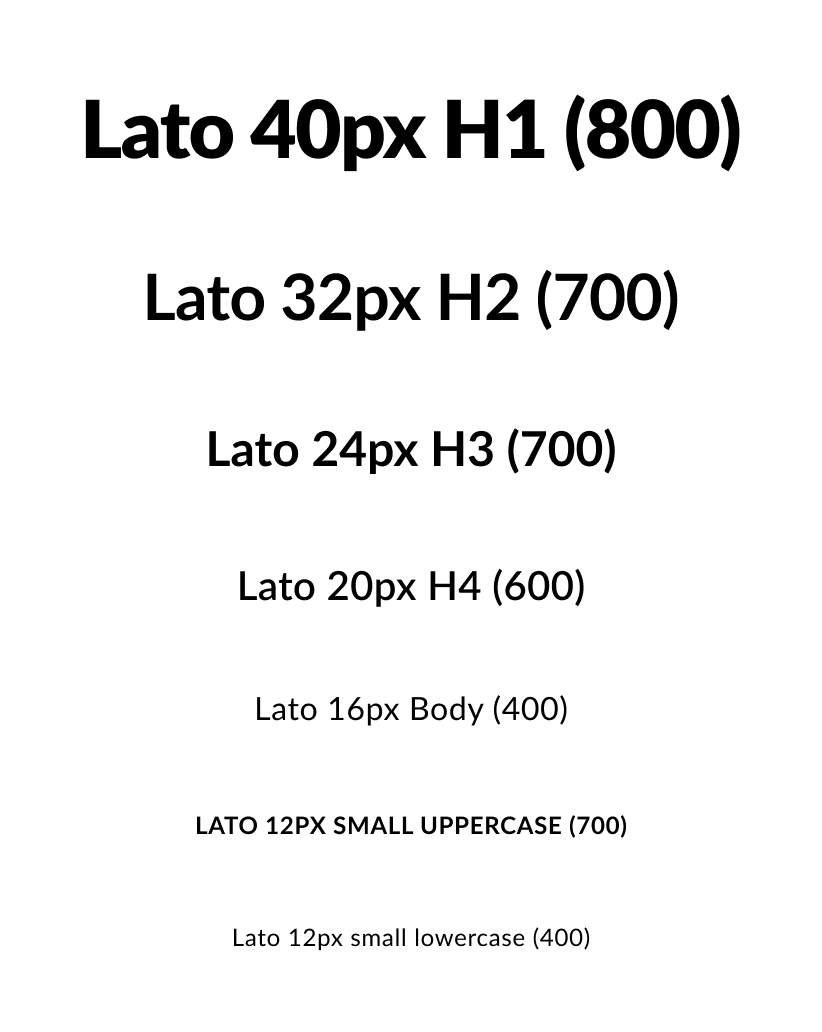
TABLE LOGIC &
DATA SCANNABILITY
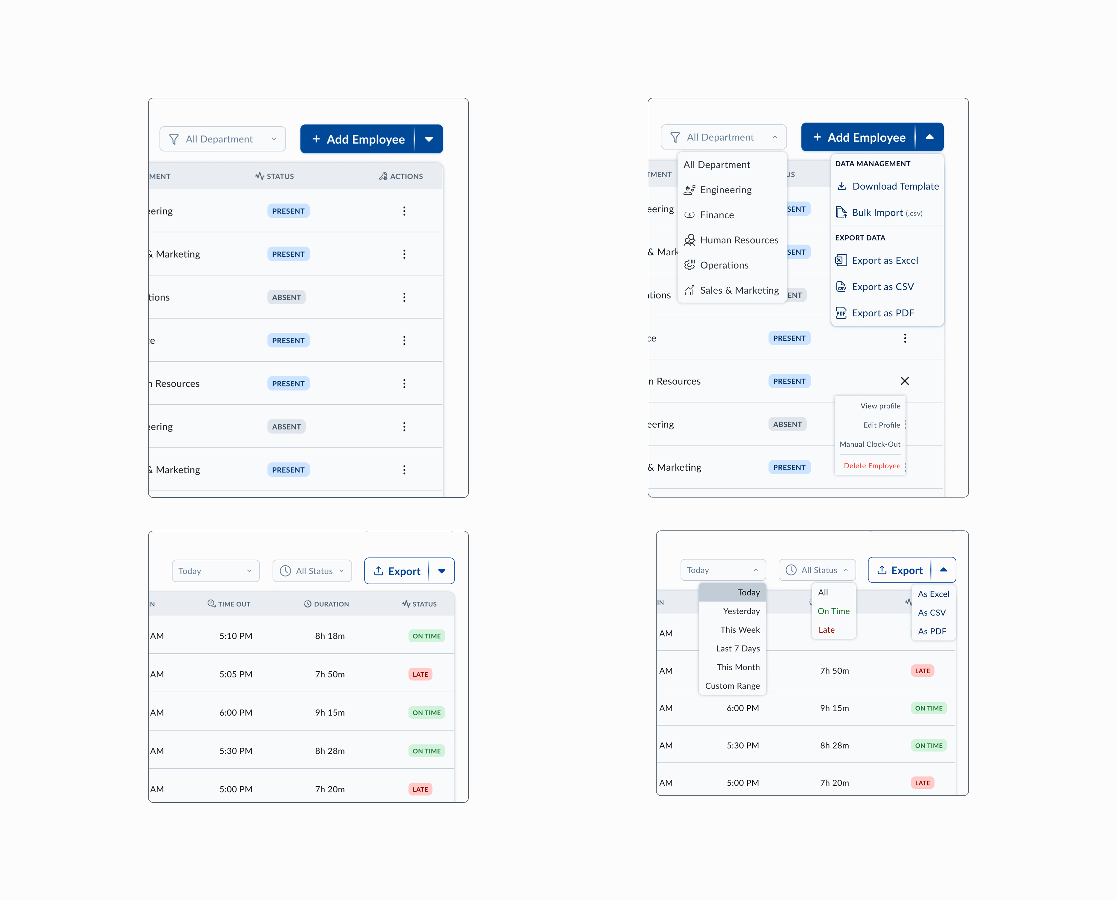
To keep massive attendance tables readable, I used progressive disclosure and multi-level filters. Instead of crowding the interface with every possible control, I grouped secondary tasks into clean dropdown menus and split-buttons. This keeps the workspace uncluttered while ensuring advanced tools are always just a click away.
- Information Layering: Using dropdown menus and custom date filters to keep the screen clean and scannable.
- Visual Cues: Integrating clean icons directly into the filter bars to help managers find categories instantly without reading through text menus.
COMPONENTS
To keep QR Track scalable and developer-ready, I built an extensive library of modular components and multi-state variants.
Beyond the basic layout, I focused heavily on interaction details—defining hover, selected, and active states for complex data filters and date-pickers.
I also created a clear feedback system with 13+ unique toast notifications, ensuring the administrator is never left wondering if a background action or bulk upload is working.
120+ UI Components
40+ Interactive States
13+ System Feedback Notifications
PROTOTYPING
I turned my final dashboard screens into an interactive prototype to stress-test the core administrative loops. I mapped out four primary paths to balance operational speed with clear safety checks and system feedback:
- Admin Login: A secure entry point that takes the manager from the Login screen straight into the live daily dashboard.
- System Navigation: Seamless movement between high-level summaries and individual employee log sheets, making sure the hierarchy never feels confusing.
- The Management Sprint: A live test of managing employee data—adding, editing, and deleting records via clean modals, while ensuring it is always easy to cancel out if a manager misclicks.
- The Feedback Loop: Testing how the app handles complex tasks like bulk imports and exports, using a library of 13+ custom toast notifications to give managers instant, clear feedback on their actions.
// TAKEAWAYS
Reflection &
Final Thoughts
“QR Track started as a quick answer to a friend's group chat message and turned into a personal challenge: proving I could transform a chaotic, paper-based workflow into a clean, digital hub.”
This project was my introduction to UI/UX, and it turned into an absolute crash course in design systems. I initially started designing these screens during my downtime at my OJT internship, but the project quickly evolved into a massive challenge of logic and scalability. I spent a month obsessing over the details, building a library of 120+ components and 40+ interactive states. It taught me that a professional dashboard isn't just a collection of static frames; it’s a living infrastructure that has to stay completely consistent under heavy data loads.
What started as a simple request to digitize a private company’s paper logbook became a deep dive into complex dashboard logic. Even though this project stayed in the design phase, seeing my peers and mentors immediately understand the layout was a massive boost to my confidence. It proved to me that there is a huge need for administrative tools that prioritize clean scannability over useless decoration. It showed me that even a 'boring' HR task can be transformed into an experience that actually makes a manager's job easier.
I’m incredibly proud of the technical depth and ownership I poured into this system. Even though it was my very first project, I treated it like a real, shipping product. Every single toast notification, modal variation, and table row state had to earn its place by serving a functional purpose. Turning a chaotic, paper-based spreadsheet routine into a clean digital hierarchy is exactly why I fell in love with product design. This project set my standard as a designer: I don't just sketch screens—I build systems.
.png)